Have a look at any Facebook comment argument or family dinner and you’ll find at least one relative complaining about how smartphones have become an addiction. While it’s true that 37% of British adults believe they use their phones too much, it is easy to see why. Waiting for the bus? Check out Twitter or try to beat your high score on whatever arbitrary game you’re hooked on. A work colleague makes a wild claim about their cousin who won an Oscar? Straight onto Google. Two months until your friend’s wedding? Best get swiping on Tinder or Bumble to find a plus one.
Whatever the situation, smartphones have become faithful companions: the Sancho Panzo to whatever hare-brained Quixotic quest you may be on. Much like Cervantes’ foil to Don Quixote, your smartphone offers dead-pan, matter-of-fact information to keep you on the straight and narrow. Or at least it did until advancements in mobile capabilities opened up a whole world of UX trends, tips and tricks. Here we dive into design and take a look at the ways UX design is changing perceptions of the mobile experience.
Overlapping Effects

Smartphone brands are in an arms race to create larger and larger screens. Apple has reduced the bevel on their latest models while Samsung has done away with them completely and incorporated a wrap-around screen. This means that visual elements are front and centre of the smartphone experience. This is where overlapping effects comes into its own. Combining and layering fonts, graphics, images and colours enriches the experience and makes an eye-catching and distinctive feel.
The sense of depth from layering also creates a more realistic image and anchors the virtual world in the real.
Branded Illustrations

Branding has developed from a name and a slogan to an all-encompassing narrative. Google is a classic example of this with their colourful figures associated with their palette and friendly approach. Being able to tell a story with characters is great to help users understand how to use your application. What’s more images are universal increasing the range of understanding from a single language audience to the world.
On a deeper level, characters and interactions make apps feel more human. This is a must in an increasingly digital world. Take a look at our article for some intriguing facts on the intriguing quest for authenticity.
Strong Contrast

Flat design has been all the rage in the past few years. As designers have moved to new trends the core of flat design is still there. A rejection of the common laws of design has resulted in apps that focus on more contrast, sharp colour combinations and ‘look at me’ attitude.
Much like their users, applications have become outspoken and empowered. Users and apps are not afraid to fly their freak flag high and apps with these elements are one way of staying on trend.
Progressive Disclosure

This technique has really come to the fore as we use our mobile devices to complete more complicated tasks. Book flights, sorting out car insurance, doing the weekly grocery shop. All of these offer hundreds of variables and options which can be overwhelming. Progressive disclosure does what it says on the tin and only shows you the relevant information as you need it. For example, booking a flight might be broken down into steps such as:
- Pick your destination
- Pick your dates
- Pick your flight
- Pick your extras
Progressive disclosure reduces the cognitive load leading to more interaction and conversion.
Location Awareness

It may seem obvious, but a mobile device’s biggest asset is its ability to be mobile. Add to this a GPS and location awareness seems like a no-brainer. Location awareness can personalise and simplify the user’s journey. Ordering food is a classic example with your phone location auto-detected to show you the nearest restaurants as well as fill in the delivery address for you.
Location awareness also allows for greater customisation with filters and stickers on social platforms like Snapchat limited to location. All of these factors lead to a better UX and ultimately greater download rate.
Buttonless Control (Swipes and Scrolls)

Swipes and scrolls have become standard practice for most mobile apps. The ‘Tinder swipe’, ‘Instagram scroll’ and ‘Google bounce refresh’ are all common practice and users have come to expect these features in their apps. No more mashing buttons or typing out lines of information, the more liquid the design, the better.
(Super) Hero Images

Hero copy is the area just below the main menu on a website. This is usually filled with a carousel of images, looped video or graphic to entice a call-to-action. Hero images are integral to mobile devices, a medium which demands quick navigation and an Occam’s Razor approach. This is why on mobile devices they are more like Super Hero Images. Brands should focus on putting their biggest sellers in the hero section or create a striking graphic that will intrigue users and get them scrolling right away.
Portrait Videos

Videos have always been popular on mobile devices. Walls of text are a death knell to mobile users and will increase bounce rates tenfold. Images and videos are the preferred methods of delivery allowing users to engage with your content without having to try too hard. Modern users have notoriously short attention spans so pictures and animations are the only way to keep them coming back for more.
However, even knowing this some app developers create videos that auto-scale to landscape mode. This can result in a pinched image or cropped video on portrait screens and ultimately, a higher bounce rate. A stunning 94% of mobile users watch videos in portrait mode so optimising videos for portrait screens is a must.
Functional Animations and Gestures
Micro-interactions are the neat little flourishes that allow users to really engage with a mobile application. A shutter sound on photos, button click animation and page transition are classic examples of these elements. They add nuance to the user’s journey and result in a more pleasant app experience.
Voice Commands
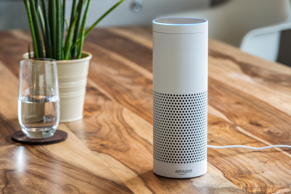
Smart devices have recently broken into another sense completely, sound activation. Google, Alexa, Siri, all of these digital assistants have opened up a new frontier of machine learning and digital interaction. App developers need to adapt to this new medium. Weather reports, voice-activated orders, and auto-dictation are just a few of the ways developers can incorporate voice commands into their applications and show off their progressive designs.
We started by comparing smartphones to the dour, down-to-earth Sancho Panza, a digital anchor providing rote facts. However, it seems with all the developments in mobile app development and design, our digital devices are more akin to the rambling, magically imaginative dreams of an ageing Don Quixote. They have become places to play, escape, learn and explore. Designers and developers have leaned into this trend with a litany of interesting techniques. Be sure to stay on top of your game by incorporating a little bit of fun into your next app design. If you’re looking for a little help along the way contact us and see how we can help you create your own mobile masterpiece.