Use them right and they will treat you right
Forms. Love or hate them! However, it’s hard to think that 86% of us fill out a minimum of one web form per week. That’s crazy, right? I bet you’ve signed up for something today or even signed into your favourite app? Boom! You’ve filled in a form.
I love forms. Can’t get enough of them. I’ve seen a fair few bad forms in my time and some amazing ones. Forms that break all laws of best practice conventions right through to a form with cracking accessibility. So I thought I would share my five ways to design optimised web forms that could create leads and convert customers and yourself to loving forms like me.
The form is potentially the first thing someone sees and it’s a crucial step in a customers journey and also a huge opportunity.
Forms are everywhere, from a simple sign up for a newsletter right through to a checkout process, any company will reap the benefits from helping people reach their goals efficiently.
Simple, clear and really concise web forms could boost lead generations, conversion rate, and customer retention. But a big stickler is that if not done right then forms could take away from all the efforts you’ve achieved elsewhere on your site.
Throughout my career, I’ve picked up on a few (that I believe) are the five best practices for designing sexy web forms:
1. Make form elements clear
Make forms easy to use
- Minimise form fields (cutting the noise)
- A well thought out Call to Action (CTA)
- Using visual contrast in the form design
- Web Form Elements
I feel that there are 5 fundamental elements that make a form more effective:
Architecture:
This includes how and where you order the fields of the form, arrange the layout of how you want the user to interact and connect between the fields.
Something that so many companies get wrong is the ordering, and ordering a form in a logical way will result in better user experience (UX).
The fields themselves:
Fields are the areas we ask users to add in their name or phone number or a password, right through to checkboxes, radio buttons and even a captcha tool.
Field labels:
These are the titles for each field telling the specific user what they need to put into that field.
Call to Action (CTA/Button):
This is for when a user would like to press something for an action to happen for example submitting their details on a registration form.
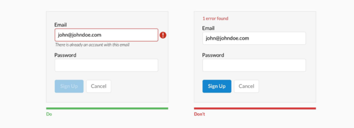
Last but not least and an important one (well they all are) is, Feedback:
This will allow the user to see the result of their input. It could be as simple as a (“Thanks for signing up!”) or if there is an error with the form (“This entry doesn’t look right, please try again” ).
This could also include any in-line validation you may want to present to the user to ease the entry process.
2. Make the form easy to use
Being clear will result in great user experience and simplifying web forms, In the end, will result in near enough anyone could use it (dependant on the user requirements). Guiding the user in what’s required will allow them to calmly touch or click that final call to action.
There are a few helpful ways to make this happen:
Be specific for example instead of saying ‘Name’ say ‘First name’.
Try to use shorter labels which could help your users scan the form concisely, navigating them towards their end goal.
Provide examples: if you think a field will confuse a user try adding something that might help them to fill it in correctly such as if it’s a CVC number (the three digits at the back of your bank card) give them a little bit of a helper text or even an icon showing them where it is.
And finally three of my favourite discussion points:
The use of asterisks/optional fields:
Detailing to a user straight up with an asterisks * (fields marked with an * are required and not optional) will allow them to skim through the form to see what they HAVE to enter. But, I feel that if the form has more required fields and only have one or even two optional fields, then instead of complicating the form and having so many asterisks and a piece of helper text, then simply use the work ‘optional’ to the right of the field title.

Not all users know what is implied by the required field marker.
The use of sentence case:
Readability of a web form is fundamental and by using sentence case – capitalisation only the first word in for longer phrases, will enhance this greatly, whereas Title case (“Sign Up Now”) can be functional for CTA buttons, however, if you want to make your CTA stand out more use UPPERCASE – but that’s another kettle of fish.
Making the title of the form easy to understand: this should illustrate to the user straight up what they are letting themselves in for and also tell them what they get for filling this form in.
Incentivising form completions will also help increase the number of forms and positive feedback.
Making it a simple form, at first sight, will increase the chance of user conversion.
3. Minimise the number of form fields
Designers always say “Less is more” and for this, it’s surely the case.
Shorter forms allow for seamless user experience, historically, the standard has been that 3 is the optimum number of fields you want on your form to max your conversion rate. But recent research by Formstack looking at data for more than 650,000 of their customers found that lead-gen forms have an average of 11 fields and conversion rate of 17%.
Something I have learned is to try and avoid overwhelming a user by requesting only the data needed to further the customer relationship.
To potentially change the perception of a user conversion rate try a staggered entry method, dividing fields between several pages will reduce the effort for the end user and a create a sense of progress, allowing the user to understand very quickly where they are in the process.
To quickly see if your forms on your website are too long, you can look at the bounce rate of that or those pages. If your bounce rate is high, think about reducing your fields.
Similarly, the length of a field should represent what the user needs to do, such as a postal code entry field and phone numbers as these have a limited character length.

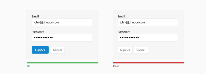
4. Add a well thought out Call to Action (CTA)
The CTA is the button on your web form which Indicates to your user what is happening next. It should also tell the user both the intent of the form and also address the user’s end action too.
For me, the text on the button and its parents are extremely important in the finalisation of the user’s action for conversion.
When designing your CTA button, remember to:
Make the CTA button large and unmistakable on the page, with colour, shadows or even size of the right typography. I believe making the button inactive until all fields have been correctly filled in to be the most effective method. This prompts the user to click on the button. Using the right type of language here will help the user to know to ‘click’ or ‘tap’ this to move onto the next stage of completion.
Language needs to be descriptive and concise to give the user a full understanding of what they are doing. For example, Sign Up vs Submit. This will, therefore, help the user know they are making the right choice when submitting the form.
Supporting a CTA button with helper text can help the user decide more if it’s what they are needing to do, such as ‘You’ll receive one newsletter per week’.
5. Using visual contrast in the form design
I believe that visual contrast is vital to form design.
Why? Because it indicates which areas deserve more attention to the user, but without these, it then may confuse your user and in this could create more bounce rate.
Users often leave a web page between 10 and 20 seconds after landing on the page. The ability to rapidly make the users decide towards an action will have an impact on the conversion rate.
These simple tips will help with conversion:
The power of colour:
Using the power a client’s brand guidelines and common design sense such as primary and complementary colours together could help your designs stand out.
Contrast:
Using a lighter box on top of a dark object will make it pop – but too much will kill the design.
Object limitation:
Designing your form in a space where there is no competing noise or objects could catch the user’s attention. When the goal is a conversion, it’s best to limit all distractions.
For example, Amazon uses a contrasting colour of their logo to help the user to navigate their eye to the CTA.

And this example where a user will be confused as to where to click if the contrast of the CTA isn’t right
Plenty of white space allows the user to be at ease and comfortable to enter in their details.
Web forms should be fast and easy to use – seamless through their journey through the page.
So, to summaries; use labels efficiently and consist. Use contrasting colours to allow the user to easily find where they need to go and shorten the form down as much as you can (without it impacting on your user needs will keep the users from bouncing). Designing the form properly will move your users to the next step and hopefully a fantastic relationship between you and your user.
Life can be short wasting time on filling long forms – who really has 5 minutes these days to fill in an online form. Let’s make them fun and be conversational where needed. Hopefully, this will convert you to make a great conversion rate form.
At Fifteen we love watching visits turn into conversions. If you’d like us to help you realise your site’s potential contact us today and we’ll help you design a form that is functional as well as faultless.