The Fifteen Project Process blog series is now in full swing. In the last instalment, Holly spoke about site-mapping and wire-framing, and in episode 3, we will be talking about the design of your website, as well as creating the content for it.
After you have given the go-ahead on your wireframes and sitemap, which Holly spoke about in detail in the previous episode in the series, ‘The Fifteen Project Process: Site-Mapping and Wire-Framing’, we will begin to put the ‘flesh on the skeleton’. In other words, we will begin to design the website based on the approved wireframes.
When starting the design of a website, our award-winning designers begin with the homepage. The homepage of any website needs to be the best it can be, not only from a visual point of view but also for the user journey and experience. This is called UX.
Using your brand colours and fonts, we will create a visual for you that will entice the user, get their interest and, more importantly, maintain their interest. We will do this by using powerful, impactful hero images that showcase your products and/or services in the best manner, as well as using headlines fit the feel of the site.
Within a design, the normal layout of a page is to have your logo in the top left corner of the site, and the navigation to the right of this. We do this because, like when reading a book, your eyes automatically go to the top left corner and scan to the right. This is best practice for keeping the user intrigued and on the site.
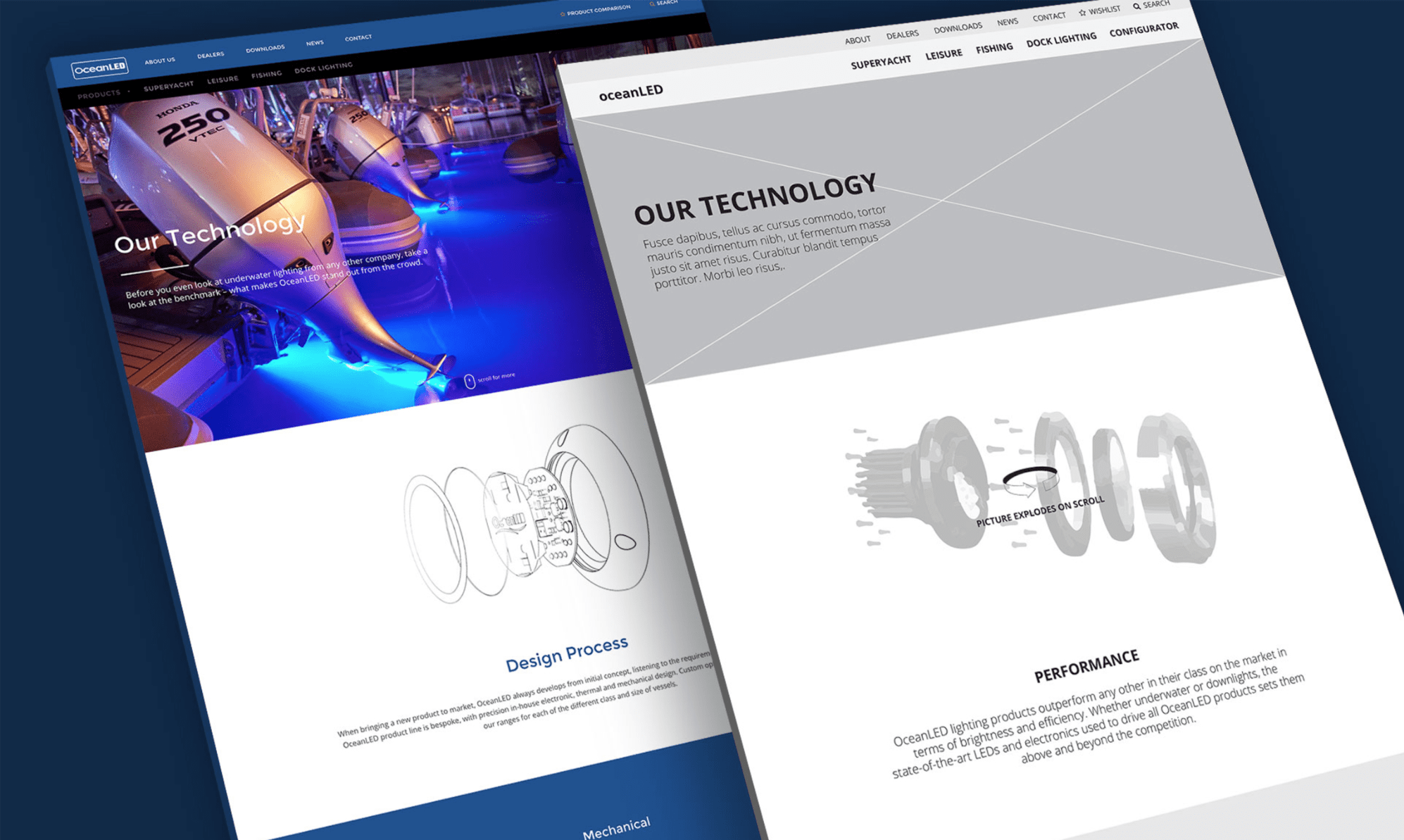
The navigation includes all links to all pages within your site, with the standard links being home, about, services/products and contact. Depending on the business that the website is for, this may vary drastically. For example, one of our clients, Ocean LED, as seen above, has a brochure site that has quite a technical navigation. They have what is called a two-tier navigation, where the pages about the company are across the top level navigation, and the pages about the products that they offer are across the secondary navigation. Splitting the navigation into two levels helps with the UX of the site as it is easier to find links and to search through the website, especially if it is a technical site or one with numerous pages.

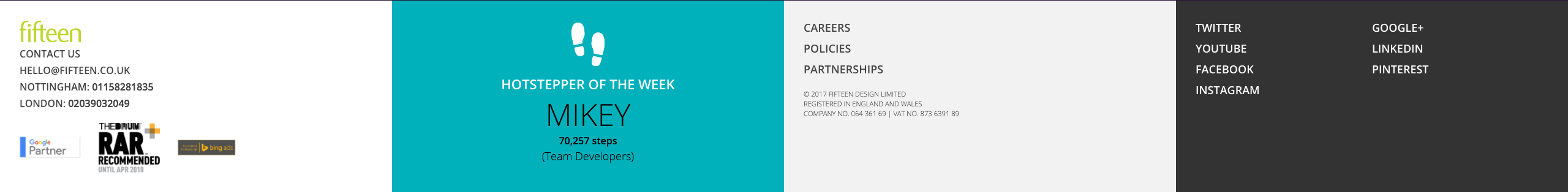
At the bottom of the page, you have the footer. This will usually include contact details, social media links and links to key pages within the site. One thing you can also do is have any awards or accreditations in the footer. This is a symbol of credibility and helps the user to put their trust in your website and your business. In the footer on our website, you can see that we have our logo with contact details and accreditations on the left as this is the first thing we want our visitors to see, as well as information pages regarding our vacancies and policies, and all of our social media links.
Once you are happy with the homepage that we have created, and you sign the design off for approval, our designers will create a style guide that the developers can use throughout the build of the website. This will include button styling, form styling and H tag styles. H tags are coding terms used for titles, sub-titles and text blocks. Creating a style guide allows the development team to be consistent throughout the website, and they also don’t have to keep writing the code every time they want to create a form or a button, they can just go to the style guide and copy the code that they have already created.
Once the style guide has been made, and the theme of the website has been finalised and agreed by the client, the designers will crack on with the rest of the designs. This includes all pages that are within the sitemap and navigation that was agreed at the beginning of the project. These pages will follow on from the design of the homepage, creating consistency throughout the website.
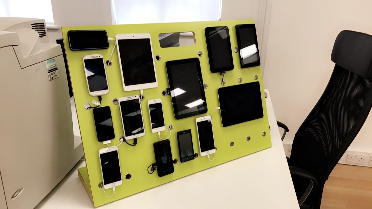
Once the client is happy with how the rest of the site looks, the final piece of designing that the designers have to create is a mobile version of the site. In 2017, it was found by Stone Temple that almost 56% of traffic comes through mobiles rather than desktop, which shows why there is a great need for the websites to be responsive and mobile/tablet friendly. All of our websites are thoroughly tested on our unique, specifically made testing board, which includes phones and tablets from loads of companies!
The next phase of the process after the designs is creating the content for the site. Content includes all of the images, text, videos, downloads and audio clips that are on, or going to be on the website.
You have to make sure the wording is right, from start to finish. Based on the approved designs, we will provide you with a ‘content guide’, which will outline all of the wording that is needed for the site, and we will include a word count for each piece of content. For SEO purposes, Google recommends that there are around 600 words per page on the website, however we appreciate that this may not always be possible.
It can be a daunting task, but if you need us, we are here to help. Our Content Specialist, Mark, is great at what he does, and what he does is write epic words for epic websites! Get in touch with us for any content creation or copywriting queries.
I hope you enjoyed this instalment in the production series. Up next in the process is website development and testing.
Over to you, Holly!