We’ve said time and time again, mobile friendly web design is a necessity for online businesses. It shows that you are prioritising the mobile browsing experience as opposed to treating it like an afterthought. But even if you have adopted web design for mobile, is it providing an excellent user experience for your users?
Many brands implement mobile web design and don’t make a strategic effort to optimise it for a continued positive user experience. That’s why we’re sharing our top five tips to improve your web design for mobile so you can ensure that your site not only looks great, but also functions seamlessly on any device. Let’s dive right in.
1. Ensure you have a simple to use navigation
The navigation on your website should be intuitive and straightforward. If it’s too complicated, you run the risk of your visitors abandoning your site because they can’t figure out how to use the navigation.
You want to aim to have no more than seven items in your top navigation to avoid overcrowding. This should consist of your main service or transactional pages, your blog or news section, and your contact page. You also want to ensure they’re evenly spaced to avoid what is known as ‘fat-finger syndrome’, where users accidentally click the wrong link because of bad spacing between clickable elements.
When users visit your site on a mobile device or tablet, they want to be able to easily find what they’re looking for without getting lost in a sea of menus and buttons. With this in mind, it’s important to use the most appropriate style of menu on your web design for mobile. A popular menu style is the hamburger menu, which gives your users streamlined access to different sections of your site.
It’s also best practice to allow for a small amount of padding between the text and the screen’s outer edge on your mobile navigation. This not only helps to improve usability, but also makes the layout much more readable and cleaner.
2. Follow a simple and straightforward web design for mobile
Following nicely from our previous tip, in order to help mobile users access your site easily and quickly, you should have a simple and straightforward design. This is because mobile device users are often looking for quick and easy access to information, so it’s important to ensure you have a clean and uncluttered layout.
One way you can do this is by keeping to a legible and easy-to-read font size. As mobile screens are much smaller than desktop screens, you want to aim to stay away from broad headings and stylised typography so your users don’t have to zoom in to read your text. Another way is to ensure you allow your CTAs to stand out. A clear path to your desired CTA should be present on your landing pages, so you should also avoid using too many elements.
By focusing on a minimalist web design for mobile, not only are you prioritising user experience but you’re also prioritising the most important information on your site. As well as this, streamlining your layout ensures quick page load times which ultimately helps boost conversion rates.
3. Make use of your white space to construct visual hierarchy
Utilising white space strategically can greatly enhance the visual hierarchy of your website. White space on a website isn’t necessarily literal white space – it’s how designers refer to these sections on your site. White space, or negative space, refers to the spacing in the left and right margins of your site, and the spacing between paragraphs or certain sections for example.
Using this element allows your page to breathe and stand out, making it easier for users to navigate and understand your content on a mobile device. According to The Daily Egg, using white space actually improves reader comprehension by nearly 20%.
You can incorporate ample white space around important elements of a web page such as headings, call to action (CTA) buttons, and images. Doing this allows you to create a clean and organised layout that guides users’ attention effectively, ultimately improving user engagement.
4. Keep your content short and sweet
As we’ve mentioned previously, mobile device users are on the lookout for quick and easy access to information, which is why it’s important to ensure your content is short, sweet, and concise. Avoiding long paragraphs and opting for shorter sentences to help you get straight to the point is a great way of doing this.
Another way of keeping your content concise is the strategic use of things like bullet points, headings, and clear formatting. Even utilising icons for certain actions such as calling and following your social media channels can not only save you prime real estate on your mobile web design but also improve your readability.
Keeping your content brief on your web design for mobile allows you to make sure your users can quickly scan and digest the information they need without feeling overwhelmed with lengthy blocks of text.
5. Ensure your forms are optimised for mobile
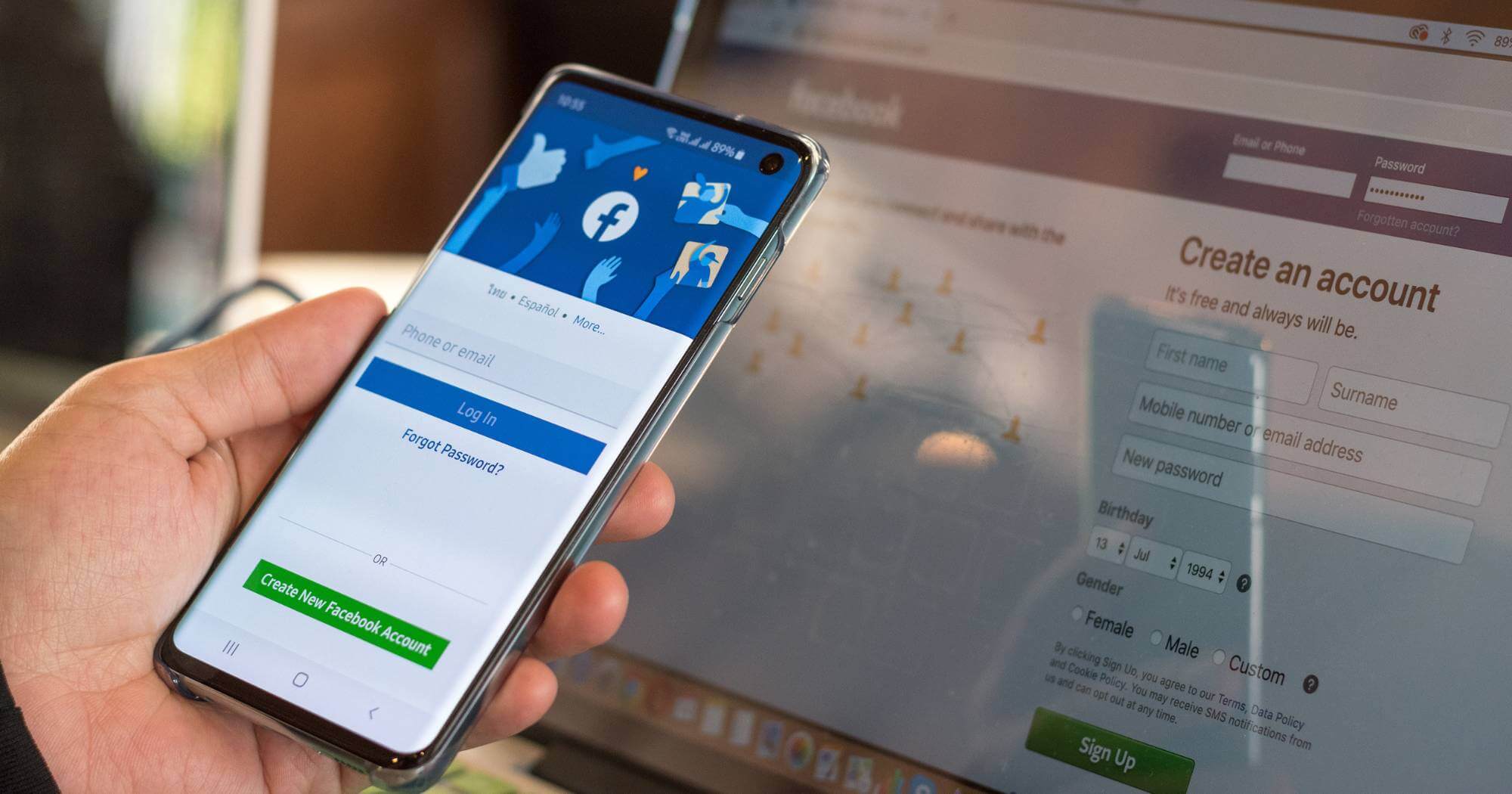
We all know that filling out forms online can be a headache, and if you haven’t optimised your forms for mobile, then this will only add to the stress and turn your users away, meaning potential conversions missed.
There are some simple ways to optimise your forms including keeping your form simple with minimum fields to complete, ensuring large touch-friendly buttons and tickboxes, and enabling auto-fill and auto-correct for speed. It’s also vital to make sure you test all of your forms on different devices to make sure they work as they should and provide a seamless experience for all users regardless of the device they’re using.
Streamlining your online forms for mobile minimises the effort and time for users to complete your forms, meaning they’re more likely to stay engaged with your site. This drives better results for your brand as well as providing an excellent user experience for your audience.
Want more mobile web design tips?
We’ve highlighted just some of the many tips for web design for mobile, which if you aren’t already implementing, you should be. These simple but effective design tips are easy to implement and will almost certainly bring a host of benefits to your site. For more information, take a look at our Web Design Do’s and Don’ts: Tips for Creating a Stunning Website blog.
If you’d like to learn more mobile web design tips, or you’d like to discuss your web design project with us, don’t hesitate to contact us. We specialise in creating stunning websites that look as good as they convert, so why not speak to our web design experts today to see how we can take your brand to a whole new level.


