Without a doubt, Flex is one of the best advancements to CSS in the past decade. Flex marks an imperative milestone to CSS and the advantages of using this layout technology over the trivial method of floats and positioning is uncanny.
So long to the days of tricky responsive hackery to get your website to reorder rendered HTML as with Flex, it’s a breeze. But this isn’t all the technology has to offer; you have complete control over your Flex items, meaning if you want to reverse or even change the direction of your elements you can easily.
CSS Flex compatibility
It feels there’s been a shadow cast over Flex amongst a lot of ‘old-school’ developers with the argument being that it is not widely supported across all modern browsers. But let’s quickly take a look at the compatibility scores from caniuse.com for Flex.
As you can see in the screenshot above, the latest two versions for every browser support Flex, the darker green colour as seen on most browsers means that CSS Flex has complete support on all of its properties. The olive coloured green as seen on IE (Internet Explorer) and the older versions of some browsers mean it has partial support which means ultimately it works, you just have to put a few modifications & prefixes in your code to get it working properly, which you can find out about here.
Let’s build a Flexible Header
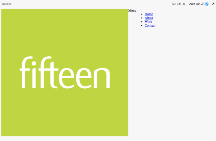
So now we know Flex is supported in all major browsers, it’s time to introduce it into our workflow. How do we do this? Pull up your CSS file or head over to an online editor (I’ll be building this in a JSbin which you can have access to) so follow along with this working example of building a desktop header menu in CSS Flex.
What we will be building today.
1). Setting up our HTML
We’re going to keep this example as simple as we can. In your HTML file, we’re going to need to add a few elements to get this working.
Let’s talk about what we’ve done in the above file from top to bottom.
• We’re using an HTML5 element called a <header> to define a header area to work within. This is a great semantic tag to use.
• We’re creating an anchor, with a class of ‘logo’ which contains an image. Most headers in websites have a logo, so it’s only fitting ours does too.
• Next, we have a div with a class of ‘nav-toggle’ which we don’t really need to worry about for now, but this will control our mobile-friendly version of the menu which will be built in Part 2 of this blog.
• Finally, we have another HTML5 element called, a <nav> and with that, we have defined a list with a <ul> with some links inside them.
2). Defining our Flex items with CSS
Here comes the part we’ve all been waiting for; but before we jump straight into writing some CSS it’s important we understand two key concepts of Flex.
With Flex we can define a Flexible container, these are the elements that wrap all of our items that we want to make flexible. We can also define our flexible elements which are the direct children of our flexible container.
Defining our Flex wrapper
With this in mind, let’s apply this rule to our HTML. Can you figure out what our Flex Container and Flex Children will be? We’ll be defining this later on in our CSS.
The Flex Container, in our case is the <header> element and the flex children are the ‘logo’, ‘nav-toggle’ and <nav> elements. This is because the <header> is the parent element that all 3 of our children elements belong to.
It’s time to define our flex container, we can do this by adding “display: flex;”
If all is well, you should have seen some magic happen! Everything should go inline. The old-fashioned way of achieving this was either using “display: inline-block;” or “float: left” on each child element, with a specified width but all we have to do now is tell the parent container to make it flexy!
Using the “display: flex;” property on an element defines it as our flex container. This means any children inside it have now become flexible. The reason your elements have gone on one line is that the default direction for flex is what’s called “row”. We can change this by using another property on our flex wrapper called “flex-direction: column” your items will now become one per line as this has now changed our flex grid from an ‘X’ axis to a ‘Y’. I’m going to cover more about our axis later on in this blog.
You can think of the flex-direction property as a way of defining our direction in the flex wrapper. Do you want items to go horizontally (row) or vertically (column)?
For our example, we want all our elements on one line, so let’s change it to “flex-direction: row;” or just remove it completely as this is the default value for flex.
Working with flex children
Now our children items are officially flexible and on the same line. We need to play around with the widths. By default, our elements widths are defined by their size, but our logo is far too big and we don’t need to work with the ‘nav-toggle’ so let’s hide that.
• First, we are defining a set width on our ‘logo’, as we don’t want this any bigger than 150px;
• We’re then telling the actual image inside our ‘logo’ to take up no more than 100% of the 150px width parent element.
• We’ve also changed the image to display block. This makes it a block level element and it will force it to take up 100% width of the parent container.
• As we aren’t doing responsive yet, we are just going to hide the nav-toggle for now.
We can now implement flex into our actual listed menu as we want them all on one line. The trivial way of doing this would be to set each <li> to “display: inline-block;” but why not put our new skill set to use and define our parent element, the <ul> as a flex container, as well as adding a few more properties to tidy up some default padding & font styles.
• As done previously, we are defining our flex container on the <ul> as this is the direct parent of the flexible items ( <li> ). We’ve also removed the default padding and margin and the list styling for the <ul>. I’ve added a border to my <ul> just so I know where exactly it starts and ends, this will be useful for later on when it comes to making it take up the rest of the space.
• We’ve also added some padding and a font family to the anchor, just to space them out a little more.
3). Changing our Flex items alignment
We’ve made great progress so far, but it’s time to introduce some new values that will change the positioning of our flex items.
CSS Property |
Accepted Values |
What it does |
| display: flex; | n/a | Defines our flex container |
| flex-direction: | Row, column, row-reverse, column-reverse | The direction our flex items flow |
| align-items: | center, flex-start, flex-end | The default alignment of our flex-container axis |
| Justify-content: | center, flex-start, flex-end | The alignment of items not on our main axis |
By default, alignment, we are talking the ‘flex-direction’ property, which we have touched on before. ‘flex-direction: row’ is the default direction of our flex axis. These means our items will go from left to right. We can make them go top to bottom by ‘flex-direction: column’. Makes sense, right?
‘align-items’ and ‘justify-content’ are the properties we use to align our flex children on the X and Y axis, by this we are talking about horizontally and vertically. We apply both these properties to our flex-container and not the flex children.
By default, with using flex-direction: row, if we apply ‘align-items: centre’ to a flex container, it will centre the items vertically and if we apply ‘justify-content: centre’ to a flex container, it will centre the items horizontally.
If we change it to flex-direction: column; the roles of these properties are then flipped, as our main axis has changed from a horizontal axis to a vertical axis, so then ‘align-items: centre’ will centre the items vertically, and ‘justify-content: centre’ will centre them horizontally. This will take some time to get used to!
Let’s put this into practice with our mega menu:
• We’ve added height 100% to our ul, which will make it take up 100% height of the parent, in this case, is the <nav> as this is the same height as the logo.
• We’ve added align-items: centre; to align the items vertically.
• Try adding ‘justify-content’ to your ul and you’ll notice it will centre them horizontally. We don’t want it in our menu so I’m going to leave it out.
With our design, we want our flex children to take up the entire width of the remaining space, if we were to do the maths behind that, we’d be trying to figure out the following:
100% (width of the window) – logo width = remaining space.
With flex, this becomes a breeze. We can use a magical shorthand property which works out the remaining space and will force a child element to take it all up.
‘flex: 1’ is the property and it short for the following values:
Flex: 1 1 0;
Equivalent to flex: <positive-number> 1 0. Makes the flex item flexible and sets the flex basis to zero, resulting in an item that receives the specified proportion of the free space in the flex container. If all items in the flex container use this pattern, their sizes will be proportional to the specified flex factor.
Let’s make out list items stretch so each one takes up an equal amount of space to fill the entire red box.
• We’ve used our magic ‘flex: 1’ property which is forcing our <nav> to take up the remaining width of its parent element.
• On the list item, we’ve also told each item to take up an equal amount of space remaining to fill up the <nav>
• We’ve added borders to separate each item.
• We’ve given them a height 100% to take up the height of the <nav> which is the same height as the logo.
• We’ve once again defined each list item as a flex container which allows us to use our positioning properties to get the text centred vertically and horizontally.
• We’ve added a background colour to make it look a little nice.
The complete CSS is below:
Conclusion
With flex, the key aspect you need to remember is we have flex containers and flex children. The flex containers control the flex children’s positioning.
The beautiful thing about CSS Flex is that it is so easy to transform it responsive. In the next blog, I’ll be covering how we can turn what we’ve turned today into a responsive menu.
For now, have a go at building your own menu and visit the JS bin we’ve created together here to have a little play! If you’re looking for more assistance, look no further than Fifteen Design. Our development team is bursting with experience and happy to help with any web development needs.


