- Creative

What are micro interactions in web design and development?
Read blog
6 tips on how to edit your writing into polished, professional copy
Read blog
Your Facebook ads checklist for effective optimisation.
Read blog
What are doorway pages and why should you be avoiding them?
Read blog
A complete guide to Google Consent Mode.
Read blog
Why Google rankings fluctuate and how to navigate them.
Read blog
6 ways to fight designer’s block.
Read blog
What are trust signals and how do they benefit businesses?
Read blog
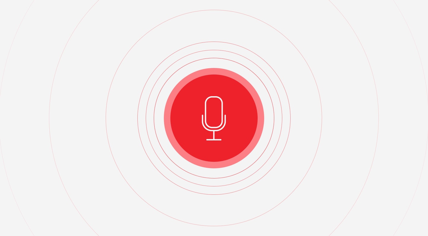
What voice search optimisation means for your SEO strategy.
Read blog
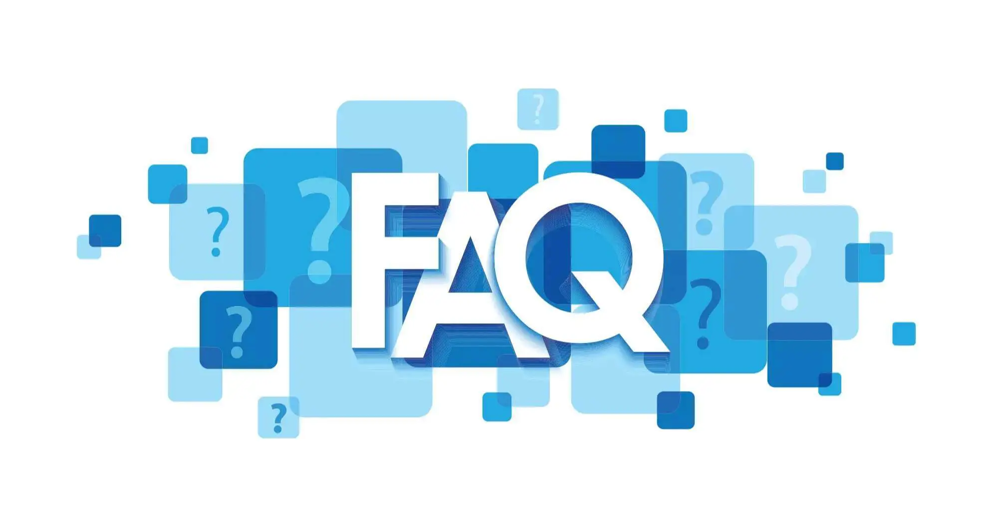
How to create a top-level FAQ page.
Read blog
How to get conversions from copywriting.
Read blog
7 digital marketing mistakes you’re probably making – and how to fix them.
Read blogLet’s make your goals a reality. Contact us.