The American internet domain registrar and web hosting company GoDaddy has rebranded in an effort to show inclusivity and their commitment to entrepreneurs.
Established in 1997 GoDaddy has gone from just a place you buy domain names to a well-established web service that provides domains, website templates and also marketing tools that help promote those websites. They have gained an astonishing amount of customers in recent years, 18.5 million to be exact.
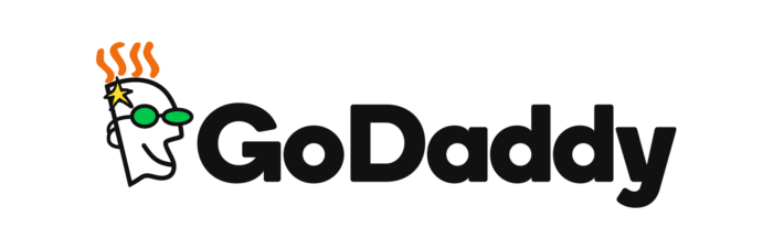
According to GoDaddy, their new logo, the “GO”, is all about “empowering you”. Along with the new logo, GoDaddy has also redesigned its website to appear more towards small businesses and show their commitment to entrepreneurs.
Here is what they had to say “Our new logo, the GO, is all about empowering you — the everyday entrepreneur — to do what you love. Go after your dreams and make ‘em real, knowing we’re here to help every step of the way”


The new logo is a combination of a “G” and “O” interlocking. The new rebrand follows a similar style to the recent rebrand of Airbnb, with the GO’s fun and friendly heart shape fit to the monochrome typeface and bold colour palette.
According to underconsideration.com, the new rebrand represents the entrepreneurial spirit, joy and humanity. Focussing on smaller businesses and entrepreneurs GoDaddy’s objective is that Entrepreneurship should be accessible to everyone. Incorporating lifestyle imagery into their digital tools and advertising campaigns. The new visual language shows the inclusivity of everyone in all aspects of life. This is probably a smart move for GoDaddy because, let’s not forget, the 2010 commercial starring GoDaddy founder Bob Parsons in the role of a dirty Genie.
Let’s be honest, GoDaddy wants to be taken seriously as a company that can help small businesses and entrepreneurs, yet unfortunately, it’s a company with the word “Daddy” in its name. Now, a company that has been around since 1997 and have become well established in the world of domain registration cannot just simply change their name. All the company can do is stick with their initial brand name at this point.
However, this isn’t the first time GoDaddy has rebranded, in 2018 they dropped the cartoon “dad in glasses” from their logo and stripped it right back to “GoDaddy” in a sans-serif font. So, it is fair to say that this new rebrand is long overdue, especially their new brand visual language.
Typography
Another big change is GoDaddy’s rebrand is their new use of typography. They have chosen a bold, pointy, serif font. Now, I like this font – however, it feels like it is unrelated to the GoDaddy logo. Visually the fonts are completely different.
Photography
According to https://godaddy.design/, they say that “Our photography lets people see themselves in our brand. Whether it’s capturing entrepreneurs in the moment or presenting them as heroes, we want their personality, independence and energy to shine through.”

Here are examples of photography that will be used throughout their advertising campaigns. The images seem fine to me and they do what they are set out to do.
Colour Palette
Their new colour palette is “bright and dynamic” according to https://godaddy.design/. This new colour palette goes in a different direction from their previous colour palette, which was a bold green.
Overall, I don’t hate the new rebrand, however, I feel that it is a total disconnect from the previous brand. I understand the message GoDaddy is trying to deliver by appearing to a wider audience and show inclusivity. But, I feel that the message isn’t being delivered in the new branding. There is too much going on and it feels as if there are a lot of visual elements that do not connect.
Take a look at the whole rebrand here https://godaddy.design/
What do you think of GoDaddy’s rebrand? Let us know.
We love everything design and keep up to date with current trends to stay sharp. If you’re interested in refreshing your logo or updating your website design contact us today.