Increase Usability of a Website with these Tips
It’s more important than ever to deliver an outstanding overall website experience to an audience. It isn’t enough for a web page to just “look nice”. Usability is a critical factor in making a website an environment more enjoyable for the user. Below we have put together a few tips to help make sure this usability is a strong focus on your website. These simple tips will leave you well on your way to increased engagement levels and more crucially, increase conversions.

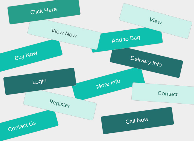
The terminology used for Buttons and Links
It’s as simple as labelling the button or link with what action they’re going to take. For example, if you are an e-commerce store that is showcasing products on the homepage, you don’t want your link to say “Buy Now” to then take a further three steps to complete this action. This example would be better suited to “View Product Info” as the terminology. The idea is to make the buttons less generic and more tailored to the content you are trying to access, avoiding user disappointment when they think they’ll be taken to a different landing page.

Application of Colour
Colour is a significant factor when it comes to friendly usability. Key buttons or text can become easily obstructed because of the colour used. Keep it simple – there should be a level of contrast between a background colour and the text colour. If this isn’t the case, it becomes difficult for the user to read what could be vital information that you want to display.

Making Links to Articles or Products more Accessible
So you’ve created some fantastic content that you can’t wait for the user to see. (There’s nothing more frustrating when trying to access an article or page and clicking the link doesn’t take you anywhere.) Any obstacles in the process will result in bad user experience. Don’t just provide one link at the end of the article or product being described, link to the appropriate landing page from images and related text as well. The user journey should be intuitive, where the user doesn’t have to overthink about how they navigate their way through the site. Card-based website designs for user interfaces has allowed the process of getting from one destination to another even more straightforward, a style which has become more popular recently for that reason.
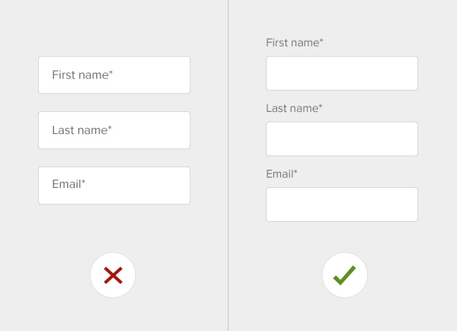
Simplify Form Fields
When creating registration forms, you want to make the process as simple as possible for the user. You can do this by using labels outside of form fields rather than inside. This avoids the user losing their place when filling in the form. This will also help your conversion rate – losing fewer customers to frustration with the registration process.
Don’t Over-stimulate the User
This is the most crucial point to take away, don’t show everything at once! You may have eight key messages that you want to get across to the user, but they won’t digest this information all at once, it’s just not natural. You’ll need to prioritise what’s most critical, then allow the user to navigate through your points, one at a time through a well thought out user journey. There’s a common misconception that essential content has to be above the fold, and this isn’t the case. As long as the information is worth scrolling for, your users WILL scroll past the top of the page.
We’ll look into some of these points in a bit more detail in the future – so watch this space! If you’d like advice on your website and how you can increase engagement and conversion contact us.