What you don’t learn in design school
When you graduate university you would assume that you would know everything there is to know about the essential software you’ll be using when working in the design industry, right? Yeah, that’s what I thought too. Now then, I’m not saying I left university clueless about the software but within the first 2 months working at Fifteen, I have gained more of an understanding of the software, than I did in the three years I was at university.
Having said that, I’m not talking about the ABCs of the software, considering it’s fair to say we all know how to use the pen tool, right?
I remember at the beginning of university when we would have a weekly two-hour slot in which we would all try and squeeze into a tiny mac room to at least try and familiarise ourselves with the basics of photoshop and illustrator. However, in my third year of university, this wasn’t the case. We were expected to know everything about the software at this stage and ‘just get on with it’.
Nevertheless, you’re probably thinking why I didn’t put in more time and effort to learn the software in my own time? Well, the reality is, I did. I would watch tutorial after tutorial to gain an understanding of the software. Granted, this taught me the essential skills I needed to navigate through the software, but it didn’t teach me the most important skills when it came to looking out for the errors in my artwork, especially when it came to typography.
To begin, we all know what Kerning, Leading, Tracking, Widows, Orphans, Rags and Rivers are right? Well, if you are a typography guru, you might be more familiar with these terms. But, for others who aren’t, let’s break it down.
Kerning
What is Kerning?
Kerning is the spacing between characters.
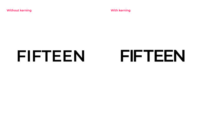
Now then, this might sound like something everyone should know (which they should without a doubt) but in university, they do not teach you this. Well, at my university they didn’t. For example, when you are designing a brochure and it has a huge amount of text, depending on the typeface you use, at times the copy can start to look a bit pressed together and this can become challenging for the user to read. Additionally, If you want to learn more about Kerning, this website type.method.ac lets you practice kerning and it even scores you on your ability to kern!
Tracking
What is Tracking?
Tracking is the spacing between groups of letters
![]()
Similar to kerning, but instead of looking at the spacing between each individual letter here we look at the spacing between each word. The same rules apply for this method as they do for kerning but, again it all depends on what typeface you are using. Nevertheless, this is something you should take note of if you are ever working with typography.
Leading
What is Leading?
Leading is the spacing between each line of text.
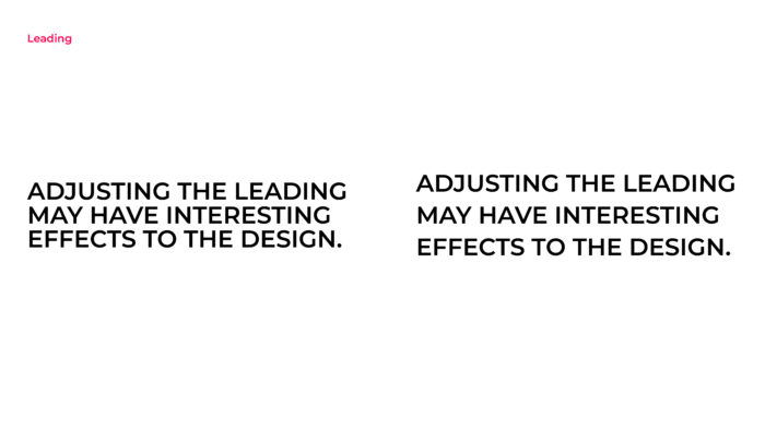
This method is one of the most important rules when it comes to typography. For example, when you have a large amount of body text, the lines in a paragraph can start to merge together. Manually reducing or increasing the leading will almost always improve the design to make everything work well together.
Widows
What are Widows?
Widows are a lonely ending line at the end of a paragraph or column and left dangling and separated from the rest of the paragraph.

This is considered poor use of typography and never looks great in huge amounts of body text. There is usually too much white space between paragraphs. Which will often confuse the user’s readability when there is a lot of text. Remembering this issue and resolving it as soon as possible will defiantly help when it comes to proofreading future projects.
Orphans
What are Orphans?
Orphans are a lonely word separated from the rest of the paragraph.

Very similar to a widow but instead this rule applies when a single word appears at the end of a paragraph or when the word appears alone at the top of the column or page.
Learning this rule and knowing exactly what to look out for will defiantly help you improve as a designer.
Rags
What are Rags?
Rags are uneven vertical margins of a block of type.
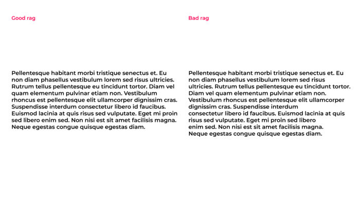
You can have a bad rag and a good rag. A good rag goes in and out from line to line and bad rag doesn’t. Sometimes breaking up the sentences is always a better option than relying on your software application which may generate a bad rag.
Rivers
What are Rivers?
Rivers are gaps that run through the white areas of a paragraph.

Now, if you have made it this far you were probably unaware of most of these terms and may have a better understanding of what they are now. Having said that, let’s dive right into rivers…
Rivers (or rivers of white) are the lines formed in between the gaps of the text in a paragraph. This is most commonly created when the ‘justify tool’ is applied to a body of text. For example, when the alignment of the spaces between each word on each line conflict with each other creating what looks like a ‘river’ running between the body of text.
Conclusion
So, how would you fix all these issues you ask? For widows and orphans, some techniques you may use to avoid or fix them would be by forcing an early page break, this can be accomplished by adjusting the kerning and/or tracking to produce tighter or looser paragraphs. You could even adjust the hyphenation of words within a paragraph, this always helps too.
Additionally, rivers and rags can be avoided or fixed by also adjusting the hyphenation and the justification settings on your text. If you don’t already you will probably want to avoid using the ‘justified’ type tool as much as you can.
Right now, you’re probably thinking how on earth you are going to remember all these issues that can occur when using typography? Don’t worry, it comes with practice. However, once you are familiar with each issue and how you can resolve them, you should correct them as soon as you can, especially if you don’t want other designers judging you (don’t worry I won’t, promise!).
With all that said, remember that typography doesn’t just consist of selecting a typeface, choosing a font size and whether it should be in regular or bold!
If you need help with your typography in your designs, don’t hesitate to contact our team of design experts.