
When someone lands on a website, they decide very quickly whether it’s worth their time. Before they’ve even read a word, they’ve taken in how the page is organised, how easy it looks to find what they need, and whether it feels clear or cluttered.
That’s the job of a good website layout structure. It quietly shapes how people move through a page, what they notice, and whether they take the next step. A strong layout can make even complex information feel simple, while a poor one can bury your most important messages, no matter how good the content is.
With so many design styles and templates around, it’s not always obvious what makes one layout better than another, or which approach suits your own website. Understanding the principles behind effective web design layouts makes those decisions much easier.
In this blog, we’ll explore what a good website design layout is in more detail, and look at why it matters, the most common web design layouts to choose from, and how to choose the right one for your pages.
What is a layout in web design?
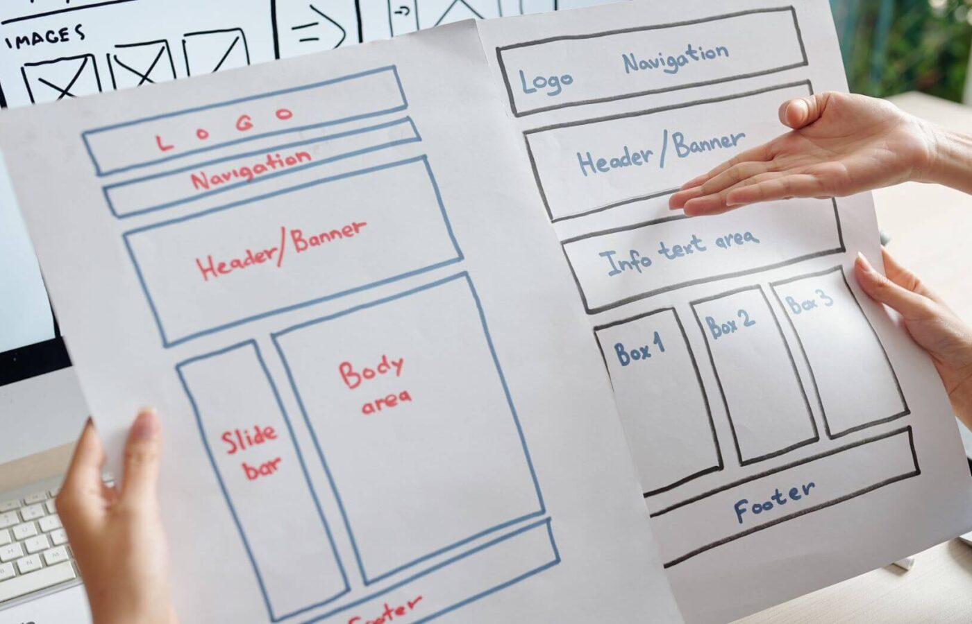
A layout in web design is the way content is arranged on a page, including where text, images, navigation, buttons, and other elements sit, and how they relate to each other. It sets the visual structure of the page and guides people through it.
A website layout usually includes:
- A header with your logo and main navigation
- A main content area, often starting with a headline and key message
- Supporting sections, such as services, features, case studies, or testimonials
- Calls to action (CTAs) that guide people to the next step
- A footer with contact details, secondary links, and legal information
A web design layout is closely linked to wireframing, which is where a page’s structure is planned before any visual design begins.
Why is a good website layout important?
Layout has a big impact on how well a website works for both your visitors and your business. Here are some of the key reasons why getting it right matters:
1. It helps people find what they need
A clear layout makes it obvious where to look and where to go next. When information is grouped logically and the most important content stands out, visitors can find what they’re looking for quickly, without having to think about it.
A good layout supports this through:
- A clear visual hierarchy, so the most important content is seen first
- Consistent placement of navigation and key elements
- Logical grouping of related information
- Plenty of white space, so content doesn’t feel crowded
When people can find information easily, they’re more likely to stay, explore, and get in touch with your business.
2. It guides visitors towards action
Every page should have a purpose, whether that’s encouraging an enquiry, a booking, or a purchase. Layout plays a big part in leading people there.
Effective layouts guide visitors by:
- Placing key messages and CTAs where people naturally look
- Building a logical flow from problem, to answer, to next step
- Using contrast, size, and spacing to draw attention to what matters
- Reducing distractions around important actions
Small layout changes, like moving a CTA higher up the page or simplifying a cluttered section, can make a noticeable difference to conversions.
3. It makes content easier to read
Most people scan web pages rather than reading every word. A good layout works with this behaviour, breaking content into digestible sections with clear headings, short paragraphs, and supporting visuals.
This makes it easier for visitors to pick out the information that’s relevant to them, and helps keep them on the page for longer.
4. It works across every device
With so many people browsing on their phones, layouts need to adapt to different screen sizes without losing clarity. A responsive layout rearranges content so it’s just as easy to use on a mobile as it is on a desktop.
That often means stacking columns, simplifying navigation, and making sure the most important information appears first on smaller screens.
5. It strengthens your brand
A consistent, well-organised layout makes your website feel professional and trustworthy. When pages follow a clear structure, visitors get a sense that your business is organised and pays attention to detail, which reflects well on your brand.
What are the most common web design layouts?
There’s no single “best” layout for every website, but there are several tried-and-tested web design layouts that work well for different types of content. Here are some of the most common ones to keep in mind:
Grid-based layout
A grid-based layout organises content into columns and rows, using consistent margins and spacing to create a balanced, structured look. It’s one of the most popular layouts for web design because it’s flexible, easy to scale, and keeps pages looking tidy. Canva shares 15 reasons why taking a grid-based approach can actually improve your designs.
A grid layout is a good fit for:
- Pages with a mix of text, images, and video
- Service or product listings
- Blog and news pages
- Portfolios and case study pages
Because content sits within a consistent structure, grid layouts are also easy to update and expand over time.
F-pattern layout
The F-pattern layout follows the way people tend to scan text-heavy pages: across the top, then down the left-hand side, scanning across again at points that catch their attention. Placing headings, key points, and links along these lines helps people take in the most important information quickly. Instapage explains how to use this layout to improve conversions.
The F-pattern works well for:
- Blog posts and articles
- Guides and resource pages
- Search results and listings
- Content-heavy service pages
Z-pattern layout
The Z-pattern layout guides the eye from the top left to the top right, then diagonally down to the bottom left and across to the bottom right. It works best on simpler pages with less text, where you want to lead people to a single action.
It’s often used for landing pages and homepages, with the logo top left, navigation or a CTA top right, and a key action at the end of the “Z”.
Single-column layout
A single-column layout presents content in one vertical flow. It’s simple, focused, and works particularly well on mobile, which is why it’s popular for long-form content, storytelling pages, and campaign landing pages.
Card or modular layout
Card layouts break content into self-contained blocks, each with an image, a heading, and a short description. They’re easy to scan and adapt naturally to different screen sizes, which makes them a good fit for blogs, product ranges, team pages, and resource libraries.
What makes a good web page layout?
Whichever layout style you choose, the best web page layouts share a few common qualities, such as:
A clear visual hierarchy
Visitors should be able to tell at a glance what’s most important on the page. Headings, size, colour, and spacing should all help guide the eye from the main message to the supporting detail and the next step.
Consistency
Keeping navigation, buttons, spacing, and styles consistent across your website makes it easier to use and helps your brand feel cohesive. People shouldn’t have to relearn how your website works on every page.
Enough white space
White space gives content room to breathe. It makes pages easier to read, draws attention to key elements, and helps your website feel calm and professional rather than cluttered.
A focus on the user’s goal
The best layouts are designed around what visitors want to achieve on each page. That might be finding a service, comparing options, or getting in touch, and every element of the layout should help them do it.
How to choose the right layout for your website
Choosing the right website layout depends on a few factors. Rather than picking a layout based purely on appearance, you should consider:
- Your content – think about the content that will go on your pages. Grid and card layouts suit a mix of text and visuals, while F-pattern and single-column layouts suit content-heavy pages.
- Your goals – keep your main goal in mind and think about the main action you want people to take on each page and choose a layout that leads them towards it.
- Your users – consider how your audience browses your site, what devices they may use, and what information they need first.
- Your data – use your website analytics, heatmaps, and user testing to see how people actually use your current pages, and let that shape your decisions.
You don’t have to use one layout across your whole website either. Many of the most effective sites use different layouts for different page types, such as a Z-pattern homepage, grid-based service pages, and F-pattern blog posts.
Looking for a professional opinion on your web design layout?
The most effective websites are built around how people actually read, scan, and use a page. While visual style is important, a good web design layout must also make information easy to find, guide visitors naturally, and work just as well on mobile as on a desktop.
By considering the layouts and keeping in mind the principles outlined above, businesses can create websites that are easier to use, more engaging, and more likely to convert.
At Fifteen, we combine user research, proven UX design, and professional website development to create layouts that are shaped by real user behaviour. From wireframing and user journey planning, to responsive, conversion-focused page design, our expert team helps businesses build websites that are clear, intuitive, and effective.
Be sure to get in touch with us today to discuss how we can help you create a website layout that works for your users and your business.