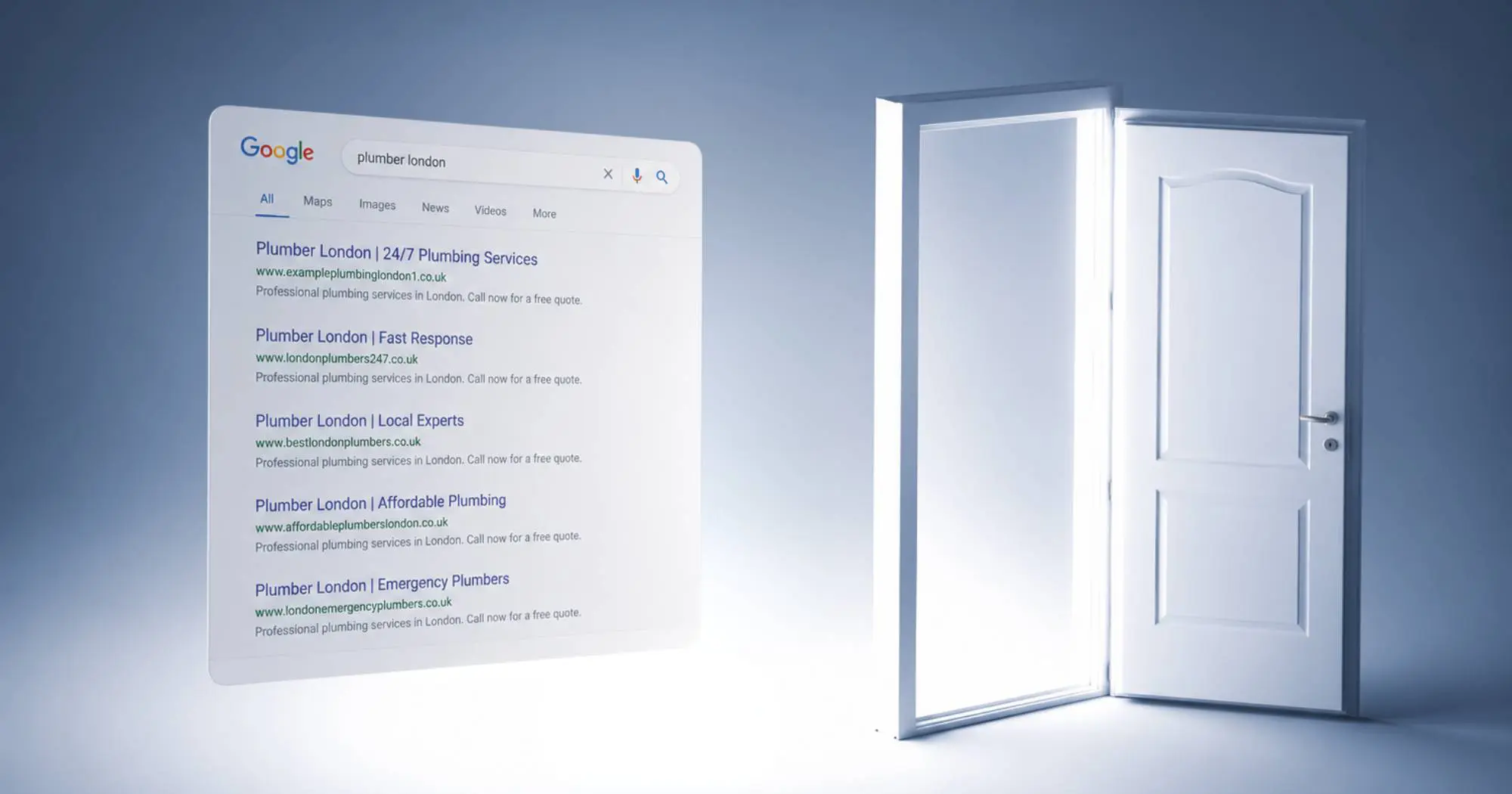
You might have heard the term ‘hamburger’ being thrown around in the web design world. By now, we’d like to think that the hamburger icon is pretty recognisable. iPhone’s OS, the Facebook app and many of Google’s various offerings makes it a daily used piece of User Interface (UI) for most internet users.
So, what’s the hamburger menu all about? In short, the three stacked lines create a symbol for a menu, which is usually hidden until clicked. This makes the menu icon look like a hamburger thanks to its simplified design.
In this blog, we look at the origins of the hamburger menu and explore whether it’s something your website should be incorporating.
Where did the hamburger menu icon come from?
Although it has rapidly become a popular visual icon for the web and apps, the hamburger icon is actually a lot older than you might think. Back in the 80s, Norm Cox was responsible for its design as part of the interface for Xerox Star, and not much has really changed about its use today.
In an interview with designer Geoff Alday, Cox told about how the symbol was created as a “container for contextual menu choices”. The design had to be simple as there were only 16 x 16 pixels to work with.
The earliest use of the symbol seems to be from Apple’s old iOS system available on the iPhone 3Gs ‘Voice Memo’ app. The symbol brought in a side menu of recording and further options within the app.
Some would credit Apple for the resurgence of the hamburger icon, but its use within Facebook’s app has also caused a revival of the three little lines. All in all, it hasn’t derived too far from its initial creation back in the 90s.
Is the hamburger menu icon a good design?
There is some debate on whether the hamburger icon is good or bad for digital design. One of the main benefits of the icon is that you can use it to hold as much or as little information as required, so it can function to your needs.
What’s often seen as a drawback however, is that some everyday users still don’t identify it as a universal symbol. Perhaps a few more years of use are what it takes to solidify this icon up there with the trash icon (usually a trash can) and the save icon (usually a floppy disk).
One particular way of using the icon and helping users identify its use is to have the icon sit alongside the word ‘menu’. In a study by New Zealand web developer, James Foster, using the word ‘menu’ in tandem with the icon can increase the click rate by 7.2%. Putting the icon inside a box (making it more like a button) is said to increase the click rate by 22.4%.
Should I use a hamburger menu design on my website?
We believe it all depends on your target market, nature of your website and size of your menu. We would also suggest implementing the hamburger menu on your website for mobile and tablet users. You can even see it in use on this very website when not on desktop. It’s a space saving design, keeping the pages looking uncluttered and modern.
We have also seen some great examples of it on desktop sites, so we wouldn’t rule out the minimalist style if it suits your site. There’s always the option of split testing, where you run two versions of your site side by side, with different versions of a menu. This way you can see which menu works best for your audience and apply it.
Will my users recognise the menu hamburger icon?
Enabling an easy user journey is vital for conversion rates on your site. It is such a well known design feature, that when users spot the menu hamburger icon, they know that’s where they can find what they need. We’ve implemented the hamburger menu design in some of our recent web projects. One website where the menu icon works incredibly well, both on desktop and mobile, is on Sales Geek.
What are the alternatives to hamburger menu?
When you’re creating an app, or if you have a very simple website there could be other options to favour. Let’s look at Instagram for example. If they were implementing the hamburger icon design, the users would have to click on the menu, choose what they wanted to do before being able to do it. Instead they have what is known as a tabbed menu. This means that the user can immediately click on the most used features like ‘Home’, ‘Search’, and ‘New Post’. This direct access to the functionality keeps the users engaged, and able to switch between features at high speed.
Speak to the experts to find out more
Hopefully you’re no longer asking yourself ‘what’s the hamburger menu?’ But, if you feel you’re still not sure which menu style to implement on your site, or you feel you need to modernise your website, get in touch with us. We can help with your design and development needs and give you advice on what will work best for your business.