- Creative
The brief
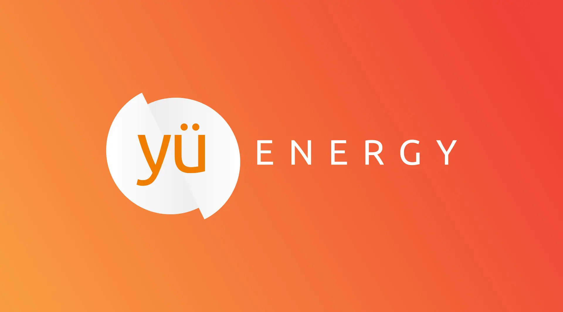
Having originally got the Yu Energy brand off the ground in 2014 with a strong logo, Yu Energy returned again to Fifteen in 2017. In three years, the business had grown in size considerably and had floated on the stock market. The Yu Energy marketing team were seeing to add depth to the way the brand was being presented to reflect the strength of their offering and to stand out in their marketplace. The marketing team also required help updating their website and getting found online. They were keen to drive traffic to their site and generate inbound leads for their sales teams to follow up.

The solution
We worked with the Yu Energy team to discover the key goals and challenges of their audience and also the unique culture that had caused Yu Energy great success up to this point in their history. We undertook a series of discovery days and brand workshops. Through these we discovered the main complications their customers were facing was poor customer service and the reason for Yu Energy’s success was their focus on customer needs. Every part of Yu Energy was customer centric ensuring swift communications and taking the strain typically experienced when dealing with energy companies away for their customers.
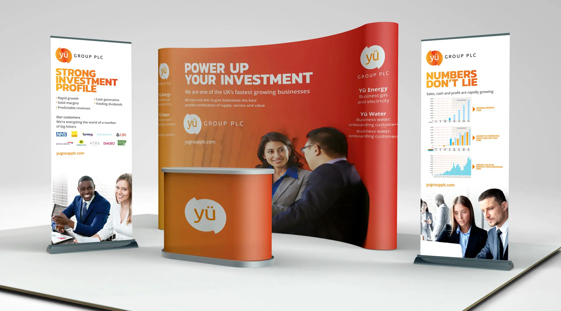
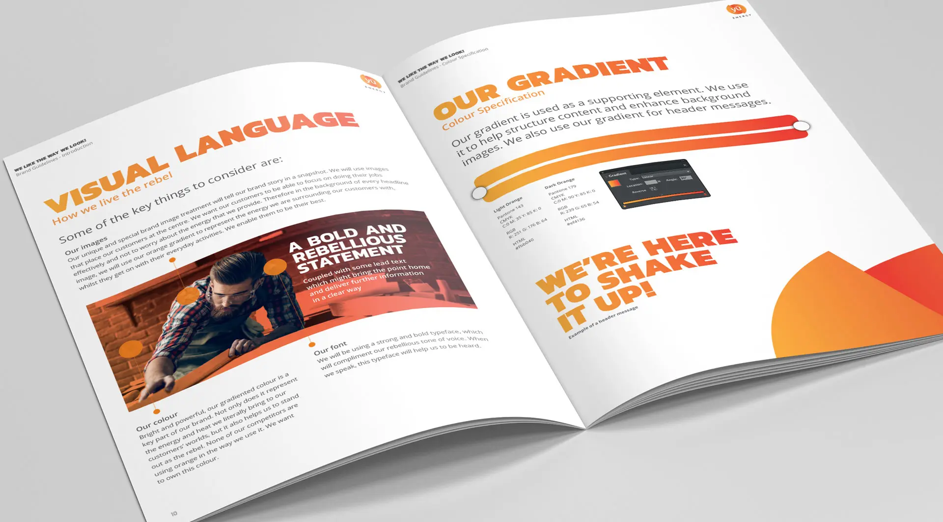
The narrative that Yu Energy needed to portray to their audience was one of complete care and control of their customers business energy, so that their customers could focus on doing what they needed to do best – run their business. We developed a unique way in which this story could be told in one image. Taking the impact of the Yu Energy logo gradient (from original to deep red), we created a visual language which added this as a wash to the background of their images. This, in one snapshot, told the story of Yu Energy taking care of the energy so that it filled the world of their customers. The customer could continue to focus on running their business.

The result
The flexible visual concept could be applied to marketing materials of all shapes and sizes and tailored to specific industry sectors or sizes of businesses. We also improved the original basic brand guidelines, producing a comprehensive set of guidelines which added depth and meaning to the reasoning behind the use of graphic elements. From our work a tone of voice guide was also produced ensuring the brand dressed and spoke in a consistent and distinctive way.
We also felt that the message of Yu Energy was disruptive and rebellious, and so this should be reflected in the way the brands headline text is designed. We chose a bolder font which helps to carry the impact and confidence that Yu Energy have in their ambitions to compete against their competition. This distinctive and rebellious look and feel differentiates Yu Energy in the marketplace making them look like no other energy company.
The design style is currently in use across landing pages and digital marketing campaigns as Yu Energy continue to grow and increase their market share.
What we didLet’s make your goals a reality. Contact us.