Brands are no longer defined by a logo, a range of colours and a typeface. With a shift in dominance from print to screen, brands can afford to be more dynamic, organic and flexible in their use of devices and elements to communicate their brand identity.
A brand identity should be able to easily reflect the values and aims of a company, whilst also being able to evolve, grow and adapt to changing situations and social environments.
As people, we have our own identity and persona that is constant, but at the same time we are sculptured and moulded through our social circles, work environments and developed as we go about our daily lives. In the same way, a brand can be considered to be like a living organism, and therefore requires a visual identity that can be dynamic and organic enough to adapt to the changing environment of the company it is designed for.
Irene van Nes describes this method of thinking as ‘dynamic brand identities’ in her book ‘How to create a living brand’. In this book she looks at how brands can be flexible in their visual style, and whilst still being structured through a range of guidelines, they are able to create a more systematic approach to their identity.
These Identities can be broken down into six systems, which we will take a look at below…
The Container
This is possibly the most obvious solution to a dynamic identity. It allows the logo to be used as a window to hold content that is constantly changing. This allows the identity to remain easily recognisable, due to only one element changing such as the colour or imagery.
City of Melbourne by Landor Associates
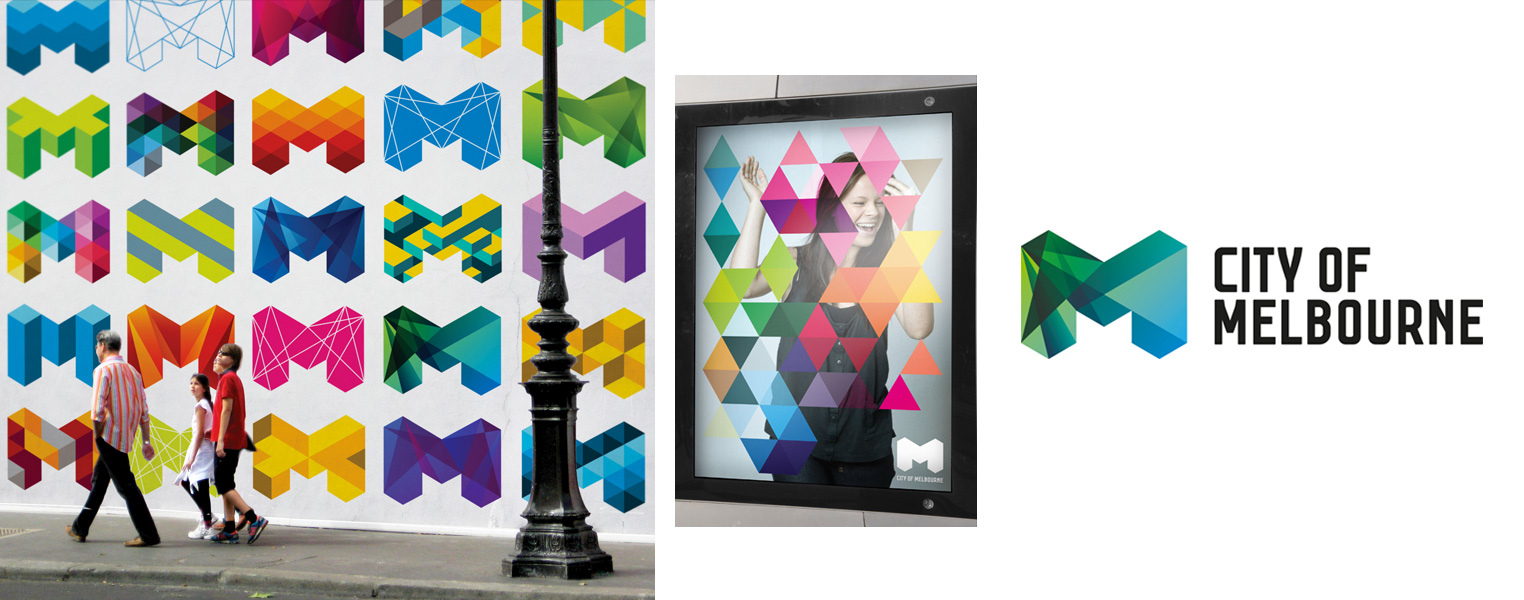
This identity uses the letter ‘M’ to create a bold and vibrant identity that is multifaceted to help capture the diversity and innovation of the city.
C-MPV by George & Harrison

C-MPV is a contemporary art gallery aimed at attracting young artists and art buyers. In order to communicate a new artist’s work, a circular visual system was generated around the logo that allows each artists’ work to be portrayed in a fresh and unique way. It also allows the gallery to maintain engagement with their young audience with a constantly evolving approach to their visual application.
Wallpaper
This is another more recognisable application of a dynamic identity. This involves using the logo as a constant but changing the shape or image behind it to vary the visual approach.
Know Canada by Bruce Mau Design
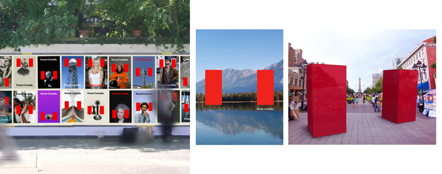
This concept is based around the premise that Canada didn’t necessarily need rebranding, but rather people just weren’t educated/aware of its offerings. It cleverly but simply takes the Canadian flag and uses this as a frame to showcase the country’s people, ideas, creativity and landscape. This campaign ran across multiple touch points, from poster campaigns, ambient structures and even an online app where people were encouraged to participate in the campaign and upload their own photos.
AOL by Wolff Olins

AOL needed to rebrand itself as a media company for the 21st century, and part of this was to put an emphasis on the importance of creativity and originality. As a result, an artwork library was created from artists across the world, that allows users to discover the work of participating illustrators, artists, videographers and photographers. These pieces of work were then used as a wallpaper to house the AOL logo across various campaigns.
DNA
This style of dynamic identity is created by using a toolbox of core visual elements that can be structured and arranged in a manner that allows for a different outcome each time.
EDP by Sagmeister & Walsh

This visual style for Portugese energy company, EDP, uses four key elements (a circle, half-circle, square and triangle) to create 85 variable EDP logomarks. This helps capture an identity that is modular, customisable and has the ability to evolve over time – which is very much like the EDP brand, who specialise in creating innovative solutions for renewable energy.
Gumbo TV by Mind Design

Gumbo TV is a platform for a wide variety of creators and artists to showcase their work. The logo uses a uses a variety of typographic styles with the letters constantly changing to reflect the variation and range of work on display.
Formula
This is similar to DNA, however, rather than let the toolbox of visual elements determine the output, this uses a system as the constant. This could be a set of rules such as a grid or size and shape, but it helps define a formula that brings the identity together.
New Museum by Wolff Olins

This new branding style for the New Museum in New York helps portray the museum as a cultural hub of contemporary culture and arts, and shake off the stereotypical associations of an art museum. This visual style used the ‘New’ and ‘Museum’ as a placeholder that literally moves to show what’s happening inside the New Museum. Its bold spectrum of colours and typeface creates a boastful identity that is hard to ignore.
NHL by Koeweiden Postma
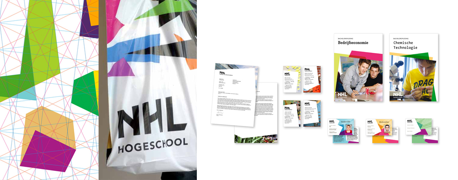
This identity for NHL, a university of applied sciences that offers the widest range of courses of any educational institute in the Netherlands, captures the core value of the university: diversity. The unconventional design of the university campus building inspired the concept of this brand. This resulted in a fractal approach to the visual language, with a range of colours and different typefaces being used across each school.
Customised
Customisation allows the clients and employees to become a very real part of the brand, and allows them to interact and feel in control. This is a step that creates a sense of community and a more emotional bond with the audience due to making the customer feel like the owner of the brand identity.
OCAD University by Bruce Mau Design

This identity aims to capture the creative energy that is inspired at OCAD University. A block of modular frames allows the students’ work to come to the forefront of the brand. This emphasises a feeling of tangibility and realness by allowing the students to really become part of the identity of the university.
Design Academy Eindhoven by The Stone Twins

This identity uses an abstract letter ‘E’ that can be used as a framework for infinite iterations of the name of the school. It encourages students and staff to physically engage with the brand and create a personalised handwritten interpretation of what the school means to them. This customisable approach creates an inclusive and dynamic feeling and removes some of the institutional nature of the previous branding.
Generative
This type of dynamic identity is very responsive to the real world and takes external data such as the weather, news, stocks, the number of visitors etc. and displays it in real time to create a visual style.
Dezeen Watch Store by Zerofee

This identity is a prime example of how the dominance of digital over print has allowed brands to become much more interactive with their identity. The logo for Dezeen Watch Store is generated by over 86,400 different colour and shape combinations. This allows for the logo to abstractly represent the local time whilst still being distinctly recognisable as the brand logo.
Second Nature by Universal Everything

Second Nature is a contemporary music events company based in France. To create a unique identity that truly represented the event, a generative process that was reactive to sound was created. This process took sound and music to produce a ‘tree-growth artwork’ that fluctuated depending on the style and intensity of the music. Different trees were generated to represent different musical events such as: classical, rock, electronic etc. This created a truly dynamic identity that can grow and develop with the event and the music being displayed.