Brands and colours are very closely aligned, with the colours of certain brands being so iconic that simply seeing that colour in an isolated form is enough to stimulate brand recognition and recall.
If you think of Mcdonalds, Mastercard or Cadbury, the visual colour palette that is associated with these brands is imperative to their identity, so much so that it is difficult to visualise one without the other. This effective use of colour makes the brand more enticing and exciting, and helps deliver an experience that influences the consumers’ response, actions and feelings towards a brand, even on a subliminal level. The impact of colour is a vital element of brand image, and Cadbury tried to trademark their iconic Dairy Milk Purple colour (Pantone 2685C) in 2004, however, despite this being rejected, their intent to do so emphasises the importance of colour to long-term brand strategy.
I remember reading somewhere that we make a decision on something within the first 90 seconds of seeing it. This could be a person, book, album, car or clothing, and apparently within that first 90 seconds, two thirds of our decision is influenced by our interpretation of colour.
Therefore, when designing your brand and its various touch points across the digital and print world, it is important to always consider the end user and the tone of voice that your brand is portraying and the context it should be perceived.
If you search colour psychology on the internet, you will be inundated with a breakdown of descriptive colour meanings and associations. For example, red is generally considered an exciting, energetic and passionate colour in Western cultures. Whereas in Asian cultures red is a symbolic colour of happiness, prosperity and joy. This shows how the interpretation of colour fluctuates across cultures, and this can be an important consideration for international brands.
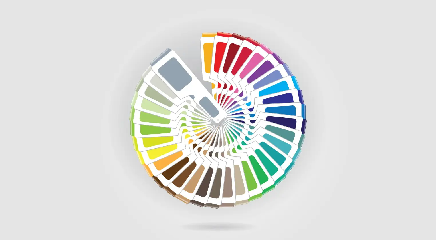
Here’s a brief breakdown of what some other colours symbolise:
Blue:
- Honesty
- Dependability
- Trust
Green:
- Health
- Environmental
- Wealth
Yellow:
- Cheerful
- Optimistic
- Warmth
Orange:
- Fun
- Creativity
- Enthusiastic
Whilst colour psychology provides a guideline to understand the general theory behind the symbolic value of a colour, personal interpretation such as experiences, cultural understanding, upbringing and context create personal disparity for each colour. It should therefore be used as a general guide rather than being taken as gospel.
Colour perception is quite personal really, and from a young age we all have a favourite colour, which indicates we all react differently to different colours. Therefore when selecting the right colour for your brand it is better to think in terms of practically rather than a psychological level.
This can be broken down into some key questions…
- Does the colour of the brand fit the product that is being sold?
- Is the colour suited to the marketplace? Or is there a colour gap in the market that will allow your brand to stand out?
- Does the colour match the tone of voice used by the brand?
- How will the audience interact with your brand, and is this colour going to make them respond in the right way?
This helps to identify the relationship between the colour and the brand by thinking how appropriate the colour is, rather than what the colour represents. Over time the personality and tone of voice of the brand will also begin to shine through, and this brand personality will begin to influence the perception of the colour. Just by making something a certain colour, it doesn’t immediately mean it carries the traits associated within the colour psychology model.
A good example of this would be to look at motorbikes. A race bike owner wants something rugged, aggressive, strong, safe and cool. If colour psychology was absolute, all these brands would operate from a limited palette. However, the reality is much different with brands offering a full spectrum of colours.
Here’s a list of just some of the varying colours of motorbike brands:
- Ktm – Orange
- Kawasaki – Green
- Yamaha – Blue
- Honda – Red
- Suzuki – Yellow
The varying range of colours displayed with similar brands shows that it’s best to not get too hung up on the stereotype of the symbolic meaning of a colour. It’s more about the overall image of the brand and how it suits the industry and audience, and colour is just a part of this. And whilst colour is an important part of a brand’s identity it should be a case of the brand and industry influencing the colour, rather than the symbolic colour stereotype dictating the brand.