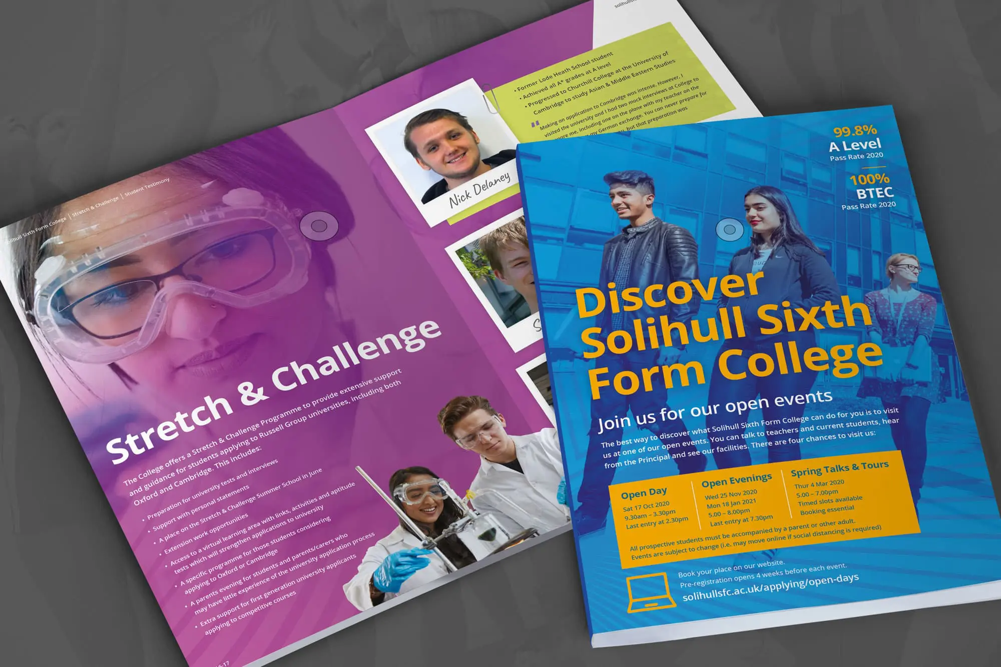
Prospectus design is something we take great pride in, we always relish the challenge and have designed prospectuses for many schools and colleges nationwide.
When designing a prospectus, I find it’s good practice to take several factors into account before getting started to help get the most out of the process which will, in turn, result in a quality product that the school or college can be proud of.
Imagery
So what to consider? For me the very first thing is imagery, this is key to a successful prospectus, after all, you could design the most beautiful prospectus and your typography could be on point but if you then fill it with substandard imagery especially images taken with mobile phones (yes, that does happen) you take everything away from it, all the handwork, the hours designing the perfect composition for each spread turning it into a thing of nightmares instead of beauty.
The best use of photography is ‘real’ photography. Using stock imagery is a real no no, the images have to be of the school or college, real environments. It’s also an opportunity to showcase the facilities the school has to offer and have students using them. This is great for students who are thinking of applying to the school or college, it gives them a sense of what the school looks like and what school life will be like there. Lighting is key too. The images have to be bright, not dark and well-lit areas should be singled out in a recce before commissioning a photographer as it’s not always possible for the photographer to carry heavy lighting equipment around with them all day.
Imagery can split up large sections of information too, helping to make the prospectus more ‘readable’ no one wants to wade through pages of text so getting this right is crucial.
Prospectus Navigation
Another thing I always consider is making the prospectus easy to read and easy to navigate through. A clear and uncluttered design always works best backed up with great use of colour. Colour can help single out key dates or other important information. The right font choice also plays a big part in a successful prospectus design, I tend to stay clear of fine decorative fonts and opt for bold clear fonts.
So now the imagery and look and feel is right, what next? Content. Is it right?
Content
It’s extremely important to get this right. For example, is the course information easy to find and is it broken down correctly? Does the content explain what grades are needed to apply for the courses and how to apply? Are call to actions clear and easy to find? Have you highlighted social media accounts?
Using a good copywriter is also key to a great prospectus. They know how to keep someone reading and can make the copy memorable. It’s important to get the tone, and grammar, right too.
The final thing I consider is getting the balance right between what the college or school has to offer academically and what the current students think about where they study.
I like to include testimonials from students, this is a great way of letting someone know what the school is like. I also like to show what is on offer outside of the school day, what the student life is like and what activities are available.
All these points put together correctly always results in a prospectus that ourselves and the client can be proud of.
Interested in revamping your school prospectus and want a professional hand? Then give us a call. We’ve been designing and creating exciting and engaging marketing materials for over a decade.


