I’ve been a designer now for a number of years and love all aspects of the design world whether it’s designing for web or print but the one thing that really floats my boat is when I’m asked to design a new company logo.
The challenge with any new logo design is making it different while at the same time keeping it simple. This allows it to stand out from its competitors and be victorious within its brand arena but above all, it has to be memorable.
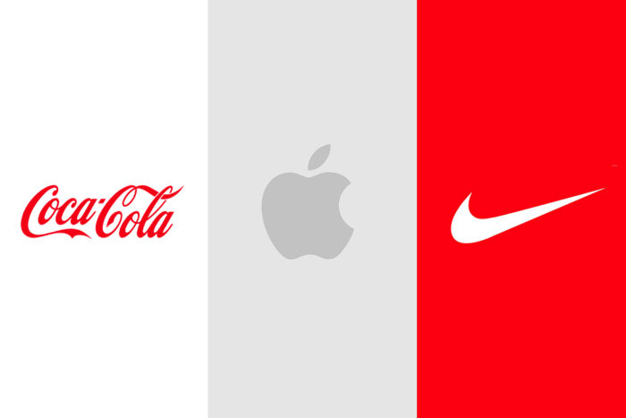
All iconic logo designs are memorable, close your eyes and think of Coca Cola, Apple or Nike and they will appear in your mind’s eye as if you have just seen them. Understandably, these logos have been around for years and millions of pounds have been spent on elaborate marketing campaigns but the principle remains the same, being memorable is key.
The Logo Design Process
So, how do you start the process of designing the ‘perfect’ logo for your client, a logo that will be a representation of their business and its offerings, a logo that will serve the test of time, well, there are many things to consider along the way but one fundamental thing is understanding your clients needs.
At this point, I should mention that to get to the absolute core of your client’s needs I would recommend running a series of workshops. These workshops are designed to discover what really makes your client tick, why they get out of bed in the morning to do what they do and what their brand stands for. These workshops cover all manner of things from discovering what brand archetypes they are to understanding their customer personas. For now, we’ll set all this aside and save it for another blog maybe, so let’s get back to the logo.
The Logo
Firstly, the obvious questions come to mind such as, what font to use, after all, there are thousands of fonts out there and choosing the correct one is crucial in the successful design of a logo. For example, you wouldn’t use ‘Cooper Black’ if you were designing a logo for a retirement home, not the conventional type anyway.
Font choice can make or break a logo, it can make the logo look corporate or fun so getting this spot on is important as it needs to give the right message to the target audience.

Another obvious design decision to make is what colours to use in the design makeup of the logo. This choice is also crucial in portraying the correct message. Using colour to evoke emotion is something designers understand well and use to its full potential so it’s important that we get this right from the start.
Choosing a red colour palette portrays ‘passion’ and ‘excitement’, some brands that fall into this bracket are Virgin, Coca Cola and Red Bull. Choosing a blue colour palette would portray ‘loyalty’ and ‘reliability’, brands that fall into this bracket are British Gas, Facebook and the UK Lotto amongst many others.
Finally, choosing a green colour palette evokes the emotion of ‘sanctuary’ and ‘trust’ examples of brands using green are BP, Starbucks and Bodyshop.
Logo design decisions
There are many other decisions to consider when designing a logo, ‘target audience’ being one of the most important. Why would you need to consider the target audience when designing a logo? Well, the logo has to be enticing in order to attract them.
Let’s say you’re designing a logo for a nursery school, your target audience would be the parents or guardians of young children so the logo needs to appeal to them. To break this down further you could list the exact criteria.
- Male and/or female
- 20 – 35 years of age
- Working full or part-time
- Have young children around the age of 4
Having identified the target audience you start to build a picture of what your logo needs to look like.
Make your logo stand out from the crowd, make it unique and memorable don’t fall into the trap of being too obvious with the design. It’s a cliché but ‘thinking outside the box’ really is important. You want your client to feel that they are getting a great service. You also want to reassure them they’re in good hands so giving them the first thing that pops into your head, in my opinion, is too easy and safe.
What I mean by all this is being obvious is not good design, if you were tasked with designing a logo for an airline company I would steer clear of using an aeroplane icon in the design, think differently, be smarter. Try to be more abstract, perhaps the silhouette of a bird’s wing or a constellation of stars.
Timeless Logos
Great logos are timeless and still look as relevant today as the day they were designed. You only need to turn to Nike for inspiration. The Nike ‘Swoosh’ icon was designed in 1971, that’s 48 years ago, and it still looks amazing, why? Because it’s so simple and doesn’t rely on fads to support it like 3D text or modelling or trendy fonts that will soon date and look tired. This is important when considering logo design the more simple you can make it the better and be mindful of font choice. Less is more, focus on a clear concept and be bold, don’t follow trends, set them.
Reinforce the Brand
Designing a logo that reinforces the client’s brand is always something that should be considered. If you get this right the finished result will be extremely powerful. Take Apple, they have adopted the ‘apple’ for their icon. The apple represents knowledge which is perfect for the company as they are known globally as world leaders in technology.
![]()
One of my personal favourites is the WWF logo, the panda symbol is so strong and recognisable and overcomes all language barriers. Incidentally, this logo was created in 1961 that’s 58 years ago, just goes to show if you get all the design elements right the end results will be extremely memorable.
And Finally
There are a lot more elements to consider when designing a logo like ‘balance’ and the use of negative space to make your logo look awesome not to mention ‘shape psychology’. Shape psychology is worth thinking about as it can help to reinforce the brand ethos, for example using a square-shaped logo gives balance, security and professionalism while a triangular shape gives the impression of stability and power. A circular logo design offers unity & community.
To finish off you need to make your logo adaptable, it has to look great in print and on screen it also needs to work when it’s big and small and finally, you need to design variations of the logo that work as solid colour and reversed out.
Giving your client a suite of logos that they can use for any online or offline need is important and shows you have a clear understanding of the design process.
Like I said at the start, designing logos and branding really is one of the best parts of my job, helping new businesses get off the ground with a solid foundation is such a good thing to part of. Make sure your branding is point and go to the professionals for your logo design. It’s much more than a simple icon or image, it is the face your customers see every day. If you’d rather leave it to the professionals contact us today and we’ll help you design a logo that hits all the targets.