You don’t become a multiple award-winning digital agency without hard graft, dedication and above all passion for the industry. We’re all encouraged to keep up to date with the latest trends, staying up to date on developments and clued up on influential people. Well, I say this but it doesn’t feel like work if you love what you do. This self-teaching is simply a benefit or side effect of browsing your favourite website or reading your approved blog of choice.
I digress, as the faint sound of sleigh bells can be heard in the distance (or if you are in the Fifteen office, the full-on Christmas playlist) we continue to hurtle towards the year 2018. One guarantee is that as our digital worlds evolve and technology and methods advance, new trends emerge and new fashions become more apparent. To be at the forefront of our industries we must recognise these from early on, to ensure we look to inject these ideas into client projects.
One area of our business that’s reliant on the visual experience, is design. And by design we mean the look, feel and usability of graphics, websites, print and other digital marketing materials. We deliver unique and current designs without exception and that’s by knowing our fields inside out. But, we aren’t the secretive type here at Fifteen. We want to share our thoughts and predictions with fellow professionals, like-minded individuals and anyone who is interested and excited about the subject as we are!
Read on for the top design trends of 2018…
Geometry
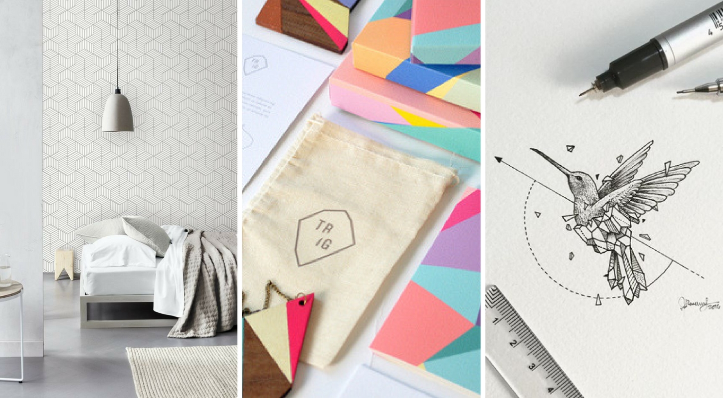
Since its arrival in 2016, geometric design has had a strong grip on the creative world. It’s recently been recognised by top colour player Pantone, who has expanded its offering into home décor – who expect 2018 to see geometric patterns in tiles, wallpapers and art.
And if you’re not using geometric visuals in your work you will be using some sort of repetitive pattern. 2018 will be full of detailed decoration, pretty patterns and interesting textures such as those inspired by traditional artworks and techniques.
Corruption & ‘Error’

Artist, Photographer and Art Director – Ernest Artillo|Poster design – Quim Marin |Sloche brand advertising – Havas Worldwide Canada
If you have a sibling, you will know the feeling of spending hours over a drawing or filling neatly between the lines in your newest colouring book, when BAM! Your beloved brother or sister knocks your elbow or dives in for quick scribble. Jealousy is an awful thing.
It seems a once unwanted, annoying design ‘error’ is fast becoming one of the most sort after effects. We admit this trend is more thought out and considered than a random act of malice. But glitches reminiscent of old videotape and the type of double exposure you would only expect to see in a darkroom discard pile will be the height of graphic design.
On the other end of the scale, those visuals made up of mixed media will see decay, decomposition and appear to age naturally. Alongside designers practising the ‘art of sabotage’ by adding to, taking away from the original image. Mirroring methods adopted by more traditional form artists such as ripping, scratching and splashing.
We already dived into design trends in the music industry and a recent example of experimental design can be seen with Taylor Swifts number one Album cover Reputation – newspaper printed over a black and white photograph.
Bright Colours
Spotify re-brand – We Are Collins
2018 will see designers rejoice in the advancements in technology and what this will mean for the use of colours in graphic design for screen and web. Our device screens are better quality and work on retina displays. The trend before leaned towards ‘safe’ pastel colours and soft hues, whereas the immediate future sees colours becoming stronger and more rebellious. Finally, we can fulfil that age-old client desire of ‘making it pop’ with playful palettes that really stand out.
Spectrums

Sexual Orgasms Series – Romain Gorisee|Spotify re-brand – We Are Collins|Green and Blacks rebrand – Bulletproof
Another aspect involving colours are the effects we put on them, how we combine them together or shift from one to the other. Instagram famously changed its logo in 2016 to incorporate a bright colour gradient. Web design in 2018 will echo this, moving on from flat, solid colour to full-on colour transitions. Forward-thinking brands will want to work on their identity colour wheel or range rather than being pinned down by a handful of brand colours as part of their guidelines.
Related to this is the persistence of progress spectrums as an alternative to loading bars. UX designer Chase Buckley says
“As humans do not experience the world in broken-up steps, rather, our experience of time and events is fluid and organic. Progress is a spectrum, not a bar.”
People don’t like to be told where they sit in the process, they would like to decipher this themselves. Progress spectrums offer a parallel to the true experience of the user along a continuous, flowing journey flowing on to the next.
Sketches and Hand-Drawn Illustrations

Purple Series – Ina Stanimirova|Bucheon International Fantastic Film Festival Poster – Jee-ook Choi|Dropbox re-brand – We Are Collins
If you wish to be unique in 2018 it will be worth contemplating the use of hand-drawn illustrations. Not an unfamiliar technique, with many brands choosing to represent themselves with original sketches but the quality and character of these drawings are to be on another level next year. Showcasing individual talent and style attracts more audience attention. Custom drawn pieces give the capacity for more imagination and as a consequence brands appear more authentic and genuine. This, in turn, builds trust with customers and audiences.
Typography

Etsy Holiday Campaign |Designer and Artist – Justina Blakeney |You’ve Got Enough on Your Plate – Scott Townsin
Creative typography has been around for a few years now and shows no signs of leaving the top design trend chart. Restrictive type is a thing of the past with inspirational and distinctive designed typography taking the spotlight. Fonts will be more complex, bespoke and hand drawn too. Embodying copy into a design can be a challenge, demanding a new way of thinking – what if the copy was the design? Think cool cropped lettering, fun chaotic presentation and clever integration with the rest of the page including other design elements and photography.
Mixed media

I Need a Guide, Art and Contemporary Imagery – Max Milly|Re.Cover Magazine Art – Ana Strumpf and Hattie Stewart|Tyler Spangler
Who says we need to stay in our boxes and only work using a certain method? Much like the colour spectrum trend, this style looks to blur boundaries and shake things up. We have flair for illustration, digital design, photography plus countless other techniques, imagine what we could produce when merging them together in one piece? Crossing over styles and merging options may wind up being some of your best work and totally unique. Like being back in a nursery with pasta shapes, glitter, paint, felt, glue and anything else you could get your hands on. Just like that, only cleaner.
Minimalism

Tom Hanks Uncommon Type Some Stories – Cornerstone Junior Designer Lauren Wakefield |Graphic design, illustration and typography – Andre Britz|Limited edition posters for Adele’s European Tour – Design Studio La Boca
Associated with modern design is minimalism, which gives the sense of uncluttered, order and purity. If you want to get your message across quickly and with a punch, adopting a minimal or even hyper-minimal style. 2018 see’s this trend take a turn towards being more daring on details or colour.
In short, the year 2018 will see designers experimenting with countless techniques and methods plus the ways in which to combine them creatively. The aim is to design something as unique and as original as possible. Advancements in technology and further ways to share our work means inspiration is plentiful and ideas should be in abundance.