- Creative

10 of the best WordPress plugins to improve your website.
Read blog
Why website image optimisation is essential for SEO.
Read blog
Our guide to planning a social media strategy.
Read blog
Tips for local SEO: How to be seen by nearby customers.
Read blog
7 ways a strong brand corporate identity can catapult your business to success.
Read blog
Our guide to Facebook advertising for small businesses.
Read blog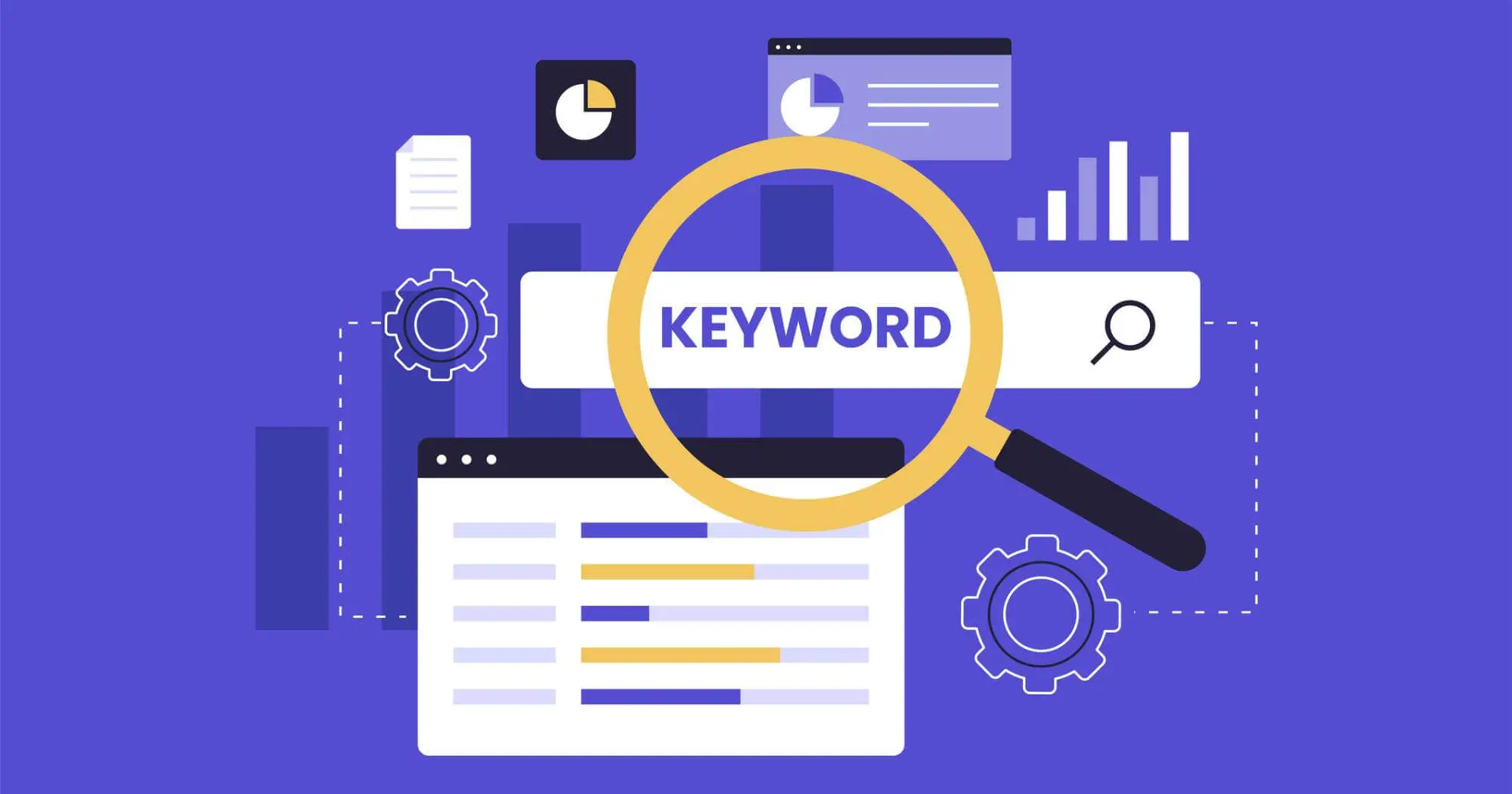
Keyword targeting vs topical content: What should you prioritise for SEO success?
Read blog
Why is it important to have good website design?
Read blog
10 ways to instantly improve a website.
Read blog
Our guide to optimising for voice search.
Read blog
What are the stages of website development?
Read blog
How to incorporate AI in digital marketing.
Read blogLet’s make your goals a reality. Contact us.