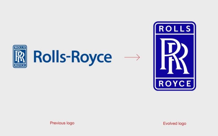
Rolls-Royce Motor Cars Limited is a British luxury automobile maker. The famed car manufacturer has joined forces with Pentagram, a multi-disciplinary, independently-owned design studio, to refresh the Roll-Royce brand strategy, tone of voice and visual identity.
Following in the footsteps of recent rebrands, especially automobile manufacturers such as BMW, Volkswagen, Nissan and Mini Cooper. The new branding brings simplicity and clarity, while successfully implementing digital applications that will hopefully appeal to a younger audience. With that said, the refresh still portrays the heritage of the brand as it is still instantly recognizable as Rolls-Royce.
According to Pentagram, the challenge for the designers was to fine-tune the brand for the small-space digital world. This arena can be difficult to make a visual impact with detailed marks. With a lot of people now using mobile and social media platforms in today’s society, ensuring your logo stands out on a small screen is immensely important.
Your logo accompanied with a device may look great on a desktop screen or up onto a billboard. However, if we were to zoom out a couple of pixels, to the size of your mobile phone screen, would your logo still have legibility?
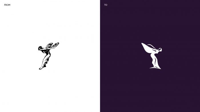
The well-known Spirit of Ecstasy ornament, originally designed by English sculptor, Charles Robinson Skyes in 1911, will now play a larger role within the new brand strategy. Pentagram has simplified the female figure so that it portrays a bolder and more minimal Identity.
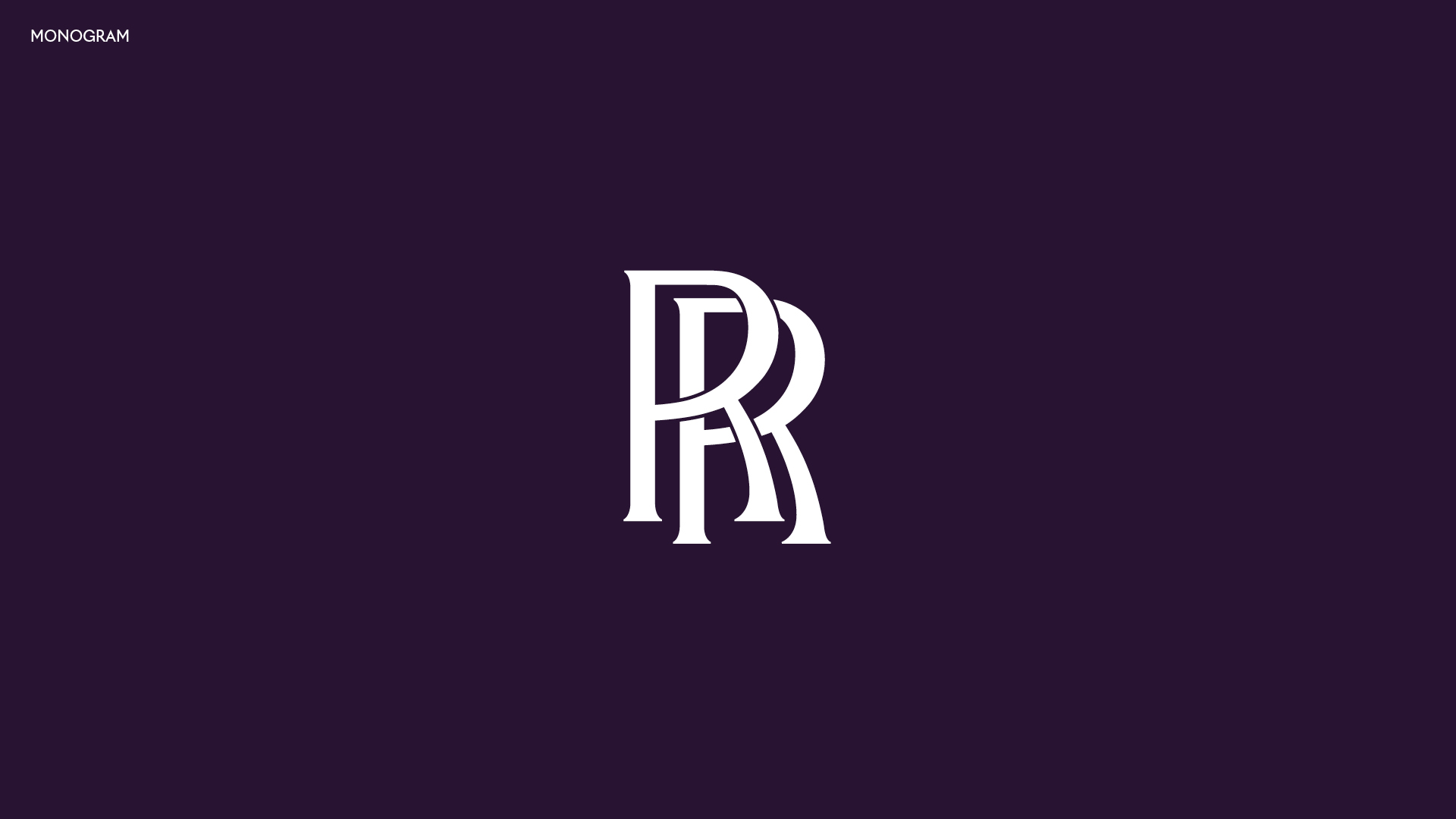
With the simplified version, they will be able to work across all digital and social platforms. The symbol has also been flipped to face towards the right, this is to represent facing towards the future. While the Spirit of Ecstasy ornament is found on the bonnet of every Rolls-Royce, the company also identify themselves with the “RR” monogram. The monogram will only appear on the car itself and as a metal badge. With that said, the Spirit of Ecstasy symbol will now replace the “RR” as the company’s main symbol.
Pentagram expand on this by saying;
“Placing the Spirit of Ecstasy at the heart of the new brand language marks a shift in resonance from an automotive to a lifestyle context.”

The designers at Pentagram have also worked on a new visual treatment for the Spirit of Ecstasy. They created the design using a unique fluid, projection-like, pattern which was created through a coding processor. This visual can be used across several platforms; from projection to embroidery, printing and engraving. The new visual portrays a 3-dimensional feel to it and almost replicates the real thing, even though it is a flat design.

The new visual identity takes Rolls-Royce further and shows they are a forward-thinking, technological brand. Compared to previous rebrands such as BMW, Volkswagen, Nissan and Mini Cooper, it is refreshing to see that Rolls-Royce has not simply gone down the route of flat design.
Pentagram has introduced subtle typography updates to the new logo as well as an impressive visual identity and voice. The thought that has gone into this rebrand is stunning. With this refreshing finish, the established luxury automobile company will make its mark in the digital age.
What do you think of Rolls-Royces’ rebrand? Let us know.
We love everything design and keep up to date with current trends to stay sharp. Interested in refreshing your logo or updating your website design?Contact us today.