Introduction to Inline Form Validation
Getting your users to fill in a form can be a tough job so once you’ve got them, the last thing you want to do is provide a poor user experience. This can result in user confusion and frustration and ultimately risks the chance of losing them halfway through completion.
Previously we discussed 5 ways to increase web form conversion, which included minimising the number of form fields, and how to make sure elements are clear. We expand on this and look at inline form validation as another blocker to form conversion.
If you’ve not heard the term ‘inline validation’ before, this is the name given to the feature found within an online form that will check the user’s information and display a message based on whether this is correct or incorrect. These will typically display whether the user has entered information wrong, but similarly can be used to display correct answers, we look into this a little later on.
Validating forms is nothing new, you may be familiar with being fed an error messages once submitting a form, sometimes this can include quite a number of issues to address, whether you’ve missed a required field or mistyped your email address. Inline input validation was brought in to try alleviate the number of errors that could occur. This helps the user get it right the first time around and sequentially reduce the number of errors to fix at the end.
Inline validation may work for your users, helping them along the way to complete the form in one hit and increase the number of successfully filled in forms you receive. However, there is also a lot of information out there that regards input validation as distracting and having the opposite effect. Below we look into some variations of validating forms and design features that can be considered.
Don’t use intrusive form validation

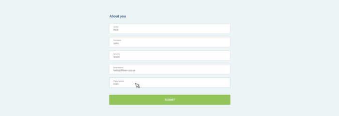
Inline validation can either occur as the user types in the field or as they click between fields. If there’s one thing that can get anyone’s back up, that would be “getting told off” when you’ve done nothing wrong.
Have you ever clicked in a form and been told to input a valid email address before you’ve even got to the second letter? Fields can be set up to check whether the correct number of digits have been included for a phone number or whether a valid top-level domain (TLD) has been used, it’s clever stuff all in aid of getting you the correct information to take action and turn an enquiry into a conversion.
Validating the field while a user is typing may seem helpful, it’s guiding them to get the correct answer the first time, but this field is looking for a TLD as soon as the user clicks into that field and firing up an error message as soon as you begin typing. This can be very distracting and frustrating to the user, taking their focus away from typing which can be counterproductive.
So, what can we do to help the user without putting them off the job?
Help the user when they change field

Keeping input validation, the required fields can be set up to validate the information after the user has clicked out of the field. If the information is deemed as wrong this will then provide a visual signifier and message to let them know of the issue and prompt them to take a look when convenient for them.
This will allow the user to focus on filling the field without any distractions, ultimately resulting in a greater chance of inputting the answer correctly the first time without any errors.
But do we have any other options?
Reinforce positive user actions

If you’re going to tell the user what is wrong, why not tell them what is right?
Providing positive messages as an addition to error messages could be a nice balance. Not only are these positive actions rewarding the user to balance the errors but they also provide a positive indication of progression through the form. These are often a very simple visual notification, such as a tick icon or colour change to the field.
How to get inline form validation right

On the other side of the argument, there is a lot of research out there that claim all inline validation is distracting and advise keeping validation till submission stage. Research shows that taking this approach removes any potential distractions, often allowing the user to complete the form quicker with less frustration.
The delivery of the form is still considered with subtle UI features that guide the user through the form, like the highlight of the current field to help focus on the active field.
On submission, the form is reloaded with a banner that notifies the user of the error and clear styling and messaging guides them to the fields that need readdressing.
There isn’t a clear answer when deciding which validation style to choose for your website. There is no right or wrong answer as all users are different and all design is subjective but including a form of validation whether this is the original way or inline, will save you from missing out on important information required to turn an enquiry into a conversion.
In my personal experience when using forms, input validation as I am writing in the field is a no, no. I don’t want to be “told off” before being given a chance. I much prefer filling in a form and being shown the error to rectify after completing, much like a little helping hand rather than interrupting my flow through the form. I also favour the positive and negative feedback, seeing the progression through the form spurs me to continue and lets me come back to the issue when I am ready.
If you think your website forms could be working harder for you or are in need of a little TLC, get in touch with our web design team or design team today and begin your journey towards better conversions.