Searching the web on studies around accessibility has me guessing what are the best fonts to use. I have also read a few blogs regarding the matter on how typography should be your first port-of-call when the brief demands accessibility.
What I am trying to say is that if the typeface you’re thinking of using isn’t right for all abilities, the design simply isn’t comprehensive for every type of user. This includes the huge number of users that include the visually impaired, the elderly and users who in-fact endure having dyslexia. I have dyslexia (a mild form of it) and I do struggle every now and again when it comes to reading or even surfing the web.
What is dyslexia?
Dyslexia a general term for disorders that involve issues with the learning to read or interpret words, letters, and alternative symbols, however, that doesn’t have an effect on the general intelligence of someone. They say even Albert Einstein was dyslexic.
The signs and symptoms of this learning disorder do differ from person to person. Every individual with the condition can have a unique pattern of strengths and weaknesses.
Dyslexia may be a learning difficulty that primarily affects the abilities involved in fluent and accurate word reading and spelling, but according to The Rose Report the definition of dyslexia is “characteristic features of dyslexia are difficulties in phonological awareness, verbal memory and verbal process speed.” And the “Co-occurring difficulties may also be seen in aspects of language, motor coordination, mental calculation, concentration and personal organisation, however, these don’t seem to be, by themselves, markers of dyslexia.”

Now that we have dug a little into the meaning, I thought I would make it even more relevant to what Fifteen do which is design including typography.
Which fonts are the easiest and best to read?
Dyslexia may be a disability that can be incredibly sensitive to some typefaces, in both websites and print. In this blog, we will show you of some of these typefaces that are recommended to suggest in what materials that are being created, they’re accessible to a everyone.
Dyslexic individuals notice all kinds of different texts where it can vary greatly relying on that the font used. I actually wish to stipulate that some typefaces are recommended to be used and to be used by people who have dyslexia throughout all types of materials and technology.
Font, especially fonts that are Serif typefaces, ‘ticks’ and their ‘tails’ located near the top and end, with most typefaces the strokes (as located in most traditional fonts like Georgia or even Times), do tend to uniquely obscure shapes of the letterforms, therefore sans-serif typefaces can be generally the most well-liked. Thus we tend to see many dyslexic individuals browse a font easier that appears almost like handwriting as they’re familiar to this and this is the reason why teachers prefer to them.

So, most of those forms of typefaces could result in confusion, and therefore combinations of letters like “oo” and “rn”; “oa” and the “m”, in my experience, could get extremely muddling and impair how I would read something that is in front of me. This said, reading a sentence incorrectly and I worry about people are judging me or completely misunderstanding what I am reading is something that I had to deal with.
This scale of the ascender letters and the descender letters (which are ‘stems’ on such letters like y) are additionally vital. Dyslexic people do believe in recalling that the letter form of words is thanks to poor awareness. When the ascenders and the descenders are short, the word which is formed can get harder to spot and may make the reading of the sentence slower, or even read incorrectly.
In that case, what makes a typeface accessible? What must you look out for once you opt for one with people who have dyslexia?
10 tips on type styles for accessibility
- Having a clean user-friendly sans serif typeface with large open counters is to be the more suitable of all the typestyles. This could be used for sub-headings where the text is 16pt and above
- Fonts with an optimum character are best to assist legibility
- Take care with the negative areas and also the positive areas too, in and around the letters – proper kerning
- Using a serif font to be added to the ‘i’ could enhance the character’s recognition
- A character stroke that is about 20% of the x-height
- Letterforms on darkened backgrounds could look tighter. With this, it could also appear to have a glow
- Numbers should be clearly simple. 0 (zero) might have a dot to assist the legibility
- Choosing a typeface with an oversized height, extended ascenders and descenders helps for better legibility
- Open terminals can really aid the clarity of letterforms to be simply read
- People with that have learning disabilities, are usually treated as childlike. This is more apparent with the jokes around the font Comic Sans. Fonts shouldn’t mean childlike, they have been created to be accessible and better for readability. A well-designed typeface with all the above considered is highly recommended
So with these points, below is a list of fonts that I think would be perfect for you to use for all kinds of materials from the web to print.
Preferred Typefaces
Read Regular
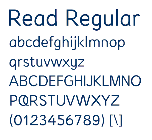
In 2003, Natascha Frensch, a graphic designer at the Royal College of Art, designed a font specifically for dyslexic readers, taking into account the issues discussed above. There are examples of Read Regular on her web site at www.readregular.com and the children’s publisher Chrysalis is now using it for two-thirds of the 150 children’s titles it brings out every year. In May 2012, Dutch educational publishers Zwijsen adopted the Read Regular typeface, where it is known as Zwijsen Dyslexic font.
Lexie Readable

This typeface is designed specifically for dyslexia. You can download it from www.k-type.com free for individual use. It was developed quite a bit over the last few months, although it still has some minor irregularities. It tries to avoid some possible dyslexic confusions (e.g. b-d) by using different shapes and is broadly based on Comic Sans, see below. Please let us know what you think of it.
Tiresias

Has been designed for Visual Impairment. Originally produced for subtitles and signs, there is now a screen version Tiresias PC font. It is good for legibility but doesn’t address the issue of dyslexia confusions.
Century Gothic

A sans-serif font which maintains the basic design of Monotype 20th Century, but has been modified to ensure satisfactory output from modern digital systems. The design is influenced by the geometric style sans-serif faces which were popular during the 1920s and 1930s.
Calibri
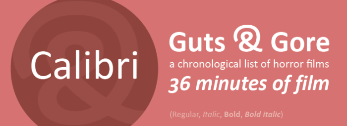
Calibri is a modern sans-serif typeface with subtle roundings on stems and corners. Its proportions allow high impact in tightly set lines of big and small text alike. Calibri was included with Windows Vista and Office 2007 and is now the default typeface for Microsoft Office.
Sassoon

This font is often recommended for dyslexia but was actually designed for early reading. Also, it is quite expensive and can be bought through Adrian Williams Design and elsewhere on the web. Letter shapes are similar to those that schools use to teach handwriting, and ascenders and descenders are exaggerated to emphasise word shapes.
Myriad Pro

A modern typeface designed by Adobe. We have begun to use Myriad Pro in our designed materials and in part on this dyslexic.com site. Myriad Pro has a clean sans-serif aesthetic making it suitable for people with dyslexia.
Web Safe Fonts
Nowadays you have a choice with fonts. You can either go to Microsoft to download the fonts that have been only given to them, or even fonts that are only available through Google Web Fonts, with their aims of making the on-screen experience easier to read, and for designers a better choice of fonts available. Some of the faults that these new fonts have can be having larger weights, short and even long ascenders and even descenders, which will make the forms of the letters more difficult to distinguish them. However, there are ones that have been commissioned to be very professional and make them possible for people to read across all kinds of media.
Trebuchet MS

Trebuchet MS has short descenders but reasonably long ascenders, small body size and generous line spacing. We find this font suits many readers.
Other Fonts
Even though there are hundreds and thousands of free fonts available worldwide, however, most of these are too fancy for someone to read or be web safe and therefore are unsuited for reams of text such as blogs and articles. But you do have fonts on your computer already that we fall back to.

Our other two choices are Geneva for the Mac and Arial for older Windows systems.
A hand full of people who are dyslexic would say that Comic Sans can be the one font that is most readable which luckily enough it’s also widely available across all devices. But on the other hand, there are many people who make jokes about this font, saying that its childish or not formal enough.

Conclusion
All in all, know your audience and also be aware of the other users who may not be able to read something without difficulty.
However, be creative too!
So if you need any more information on what you need for your customers or need us to design that perfect piece of work that can be accessed by all then please drop us an email or give us a call on 0115 932 5151 and we can discuss more.