- Creative

The brief
The way Innes England were presenting themselves had become dated and was not a reflection of the forward thinking commercial property business of the future they were and have ambitions to become. Previously their marketing activities had very much focused on “what” they were doing but not much work had been done on “why” they did what they did.
The Innes England board had a new and ambitious growth and to fuel that a branding and repositioning process was required. The challenge was that the business had a large amount of Directors who all had to be united and brought through the process.
The activity was to ultimately end with a new brand identity and visual language to position the brand in a unique but authentic way in the marketplace.
The solution
The Fifteen team went through various workshops and consultancy activities with the Innes England leadership team. These included various discovery days with staff interviews, a full customer journey review, persona development, story telling workshops to discover and define the brand story, a brand personality and tone of voice workshop and much more.
The information we gleaned from these activities allowed us to obtain a solid direction and inform a creative process which the leadership team could buy into whilst allowing us to add creativity and expertise. One of the key things we learnt was the high level of localised expertise the Innes England team had in a very changing market place.
The other challenge of the brief was that the leadership team had set the values of the brand but these were not readily understood nor being consciously lived by employees. We helped the Innes England team to better appreciate what the values meant in terms of how they were to be out-worked and assisted in defining and presenting these to the team.
The result
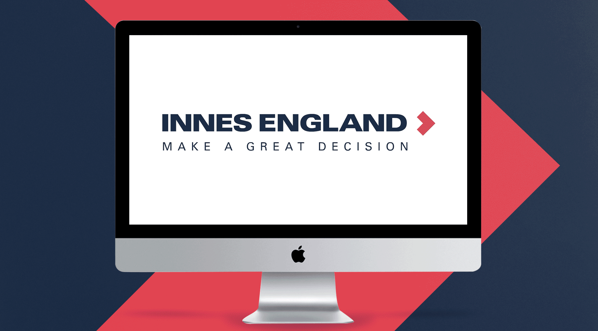
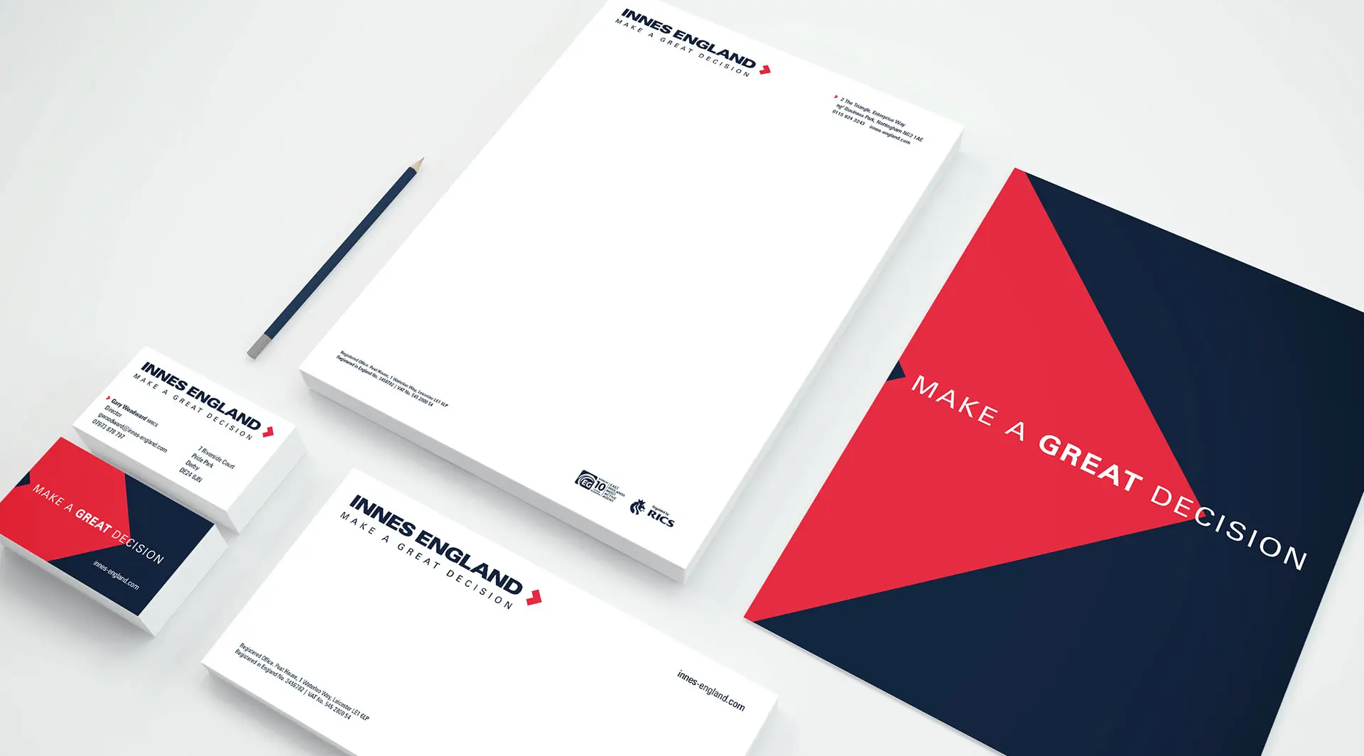
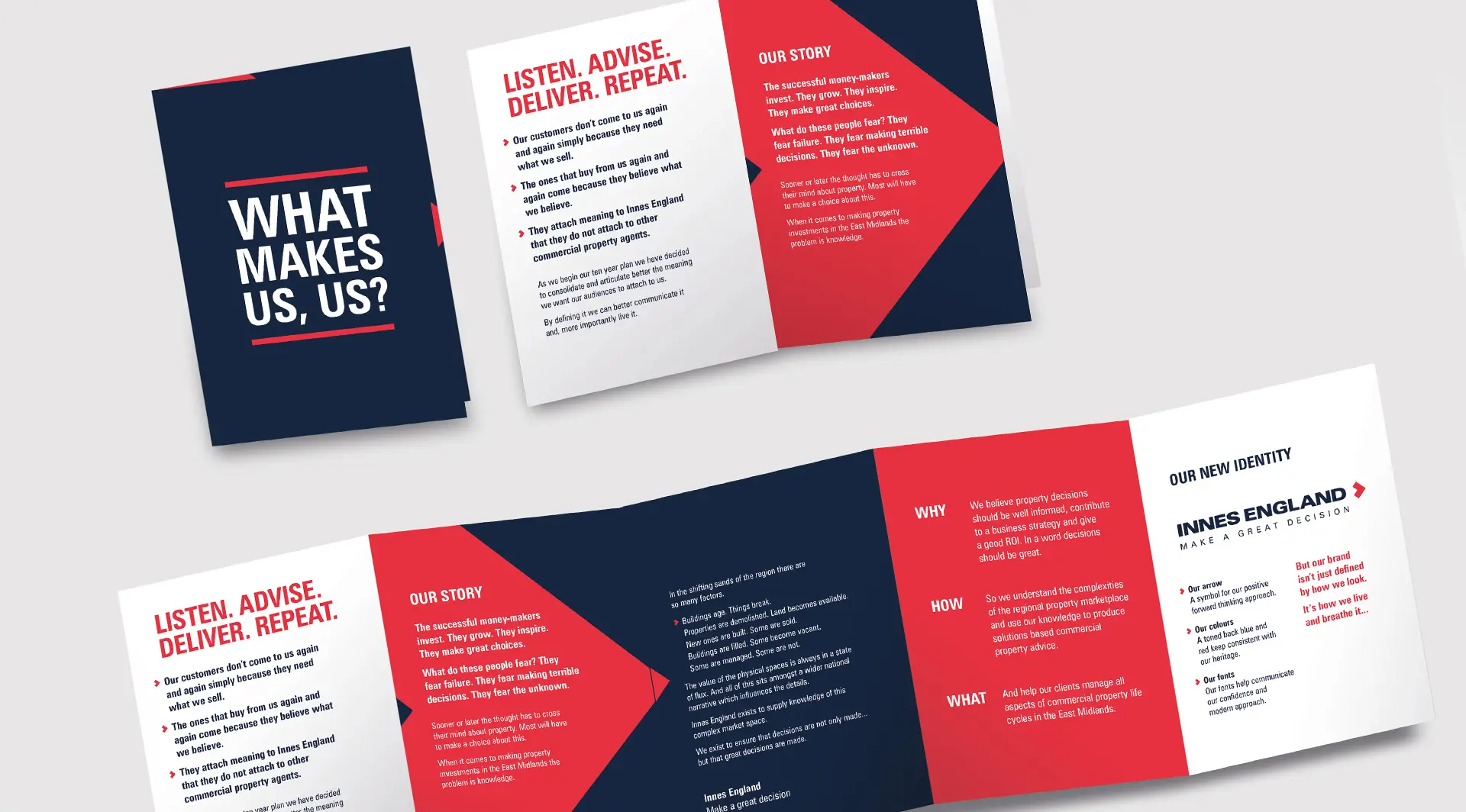
The results have manifested themselves in purpose led brand positioning to help clients “Make a great decision”. This key concept underpinned a new brand identity and visual language. We reshaped the old logo into an arrow which symbolises the future aspirations of the brand and the forward thinking nature of what they deliver. We toned the colours down to be more mature and chose a modern powerful typeface.
During the process we uncovered Innes Englands “Why” – to help the East Midlands thrive. They do this by enabling their clients to make great decisions. This became the basis of the brand story and was adopted as their new motto which helps to explain, not simply “what” but “why” they do what they do.
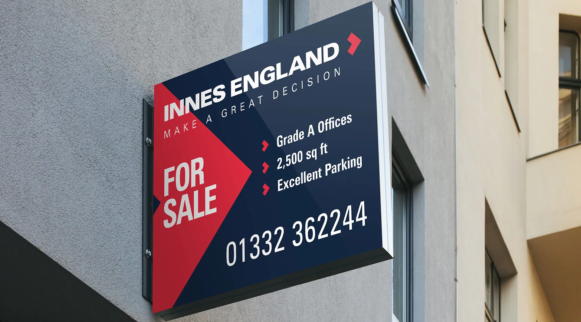
The prominent, noticeable and unique red arrow of the brand has been powerfully used.
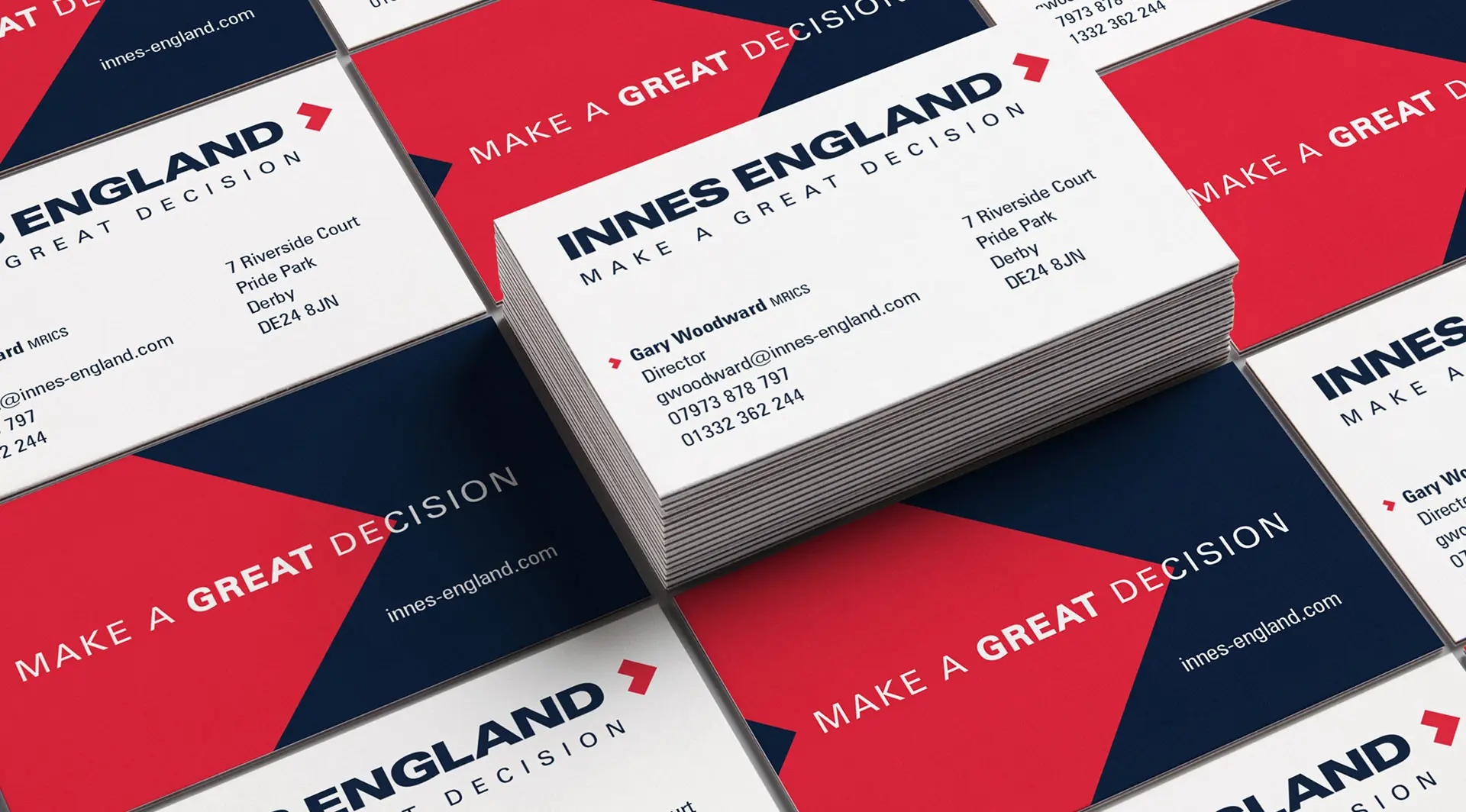
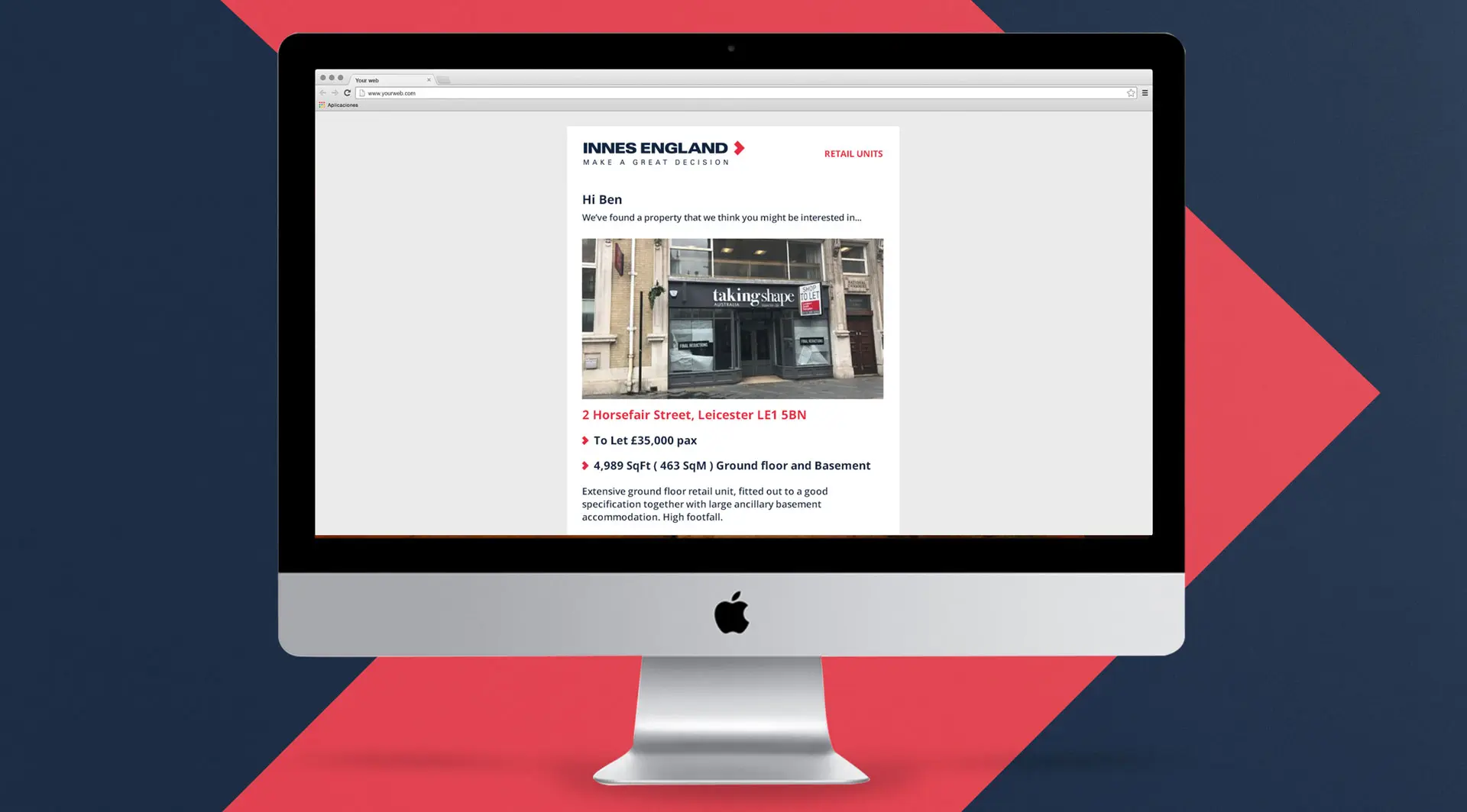
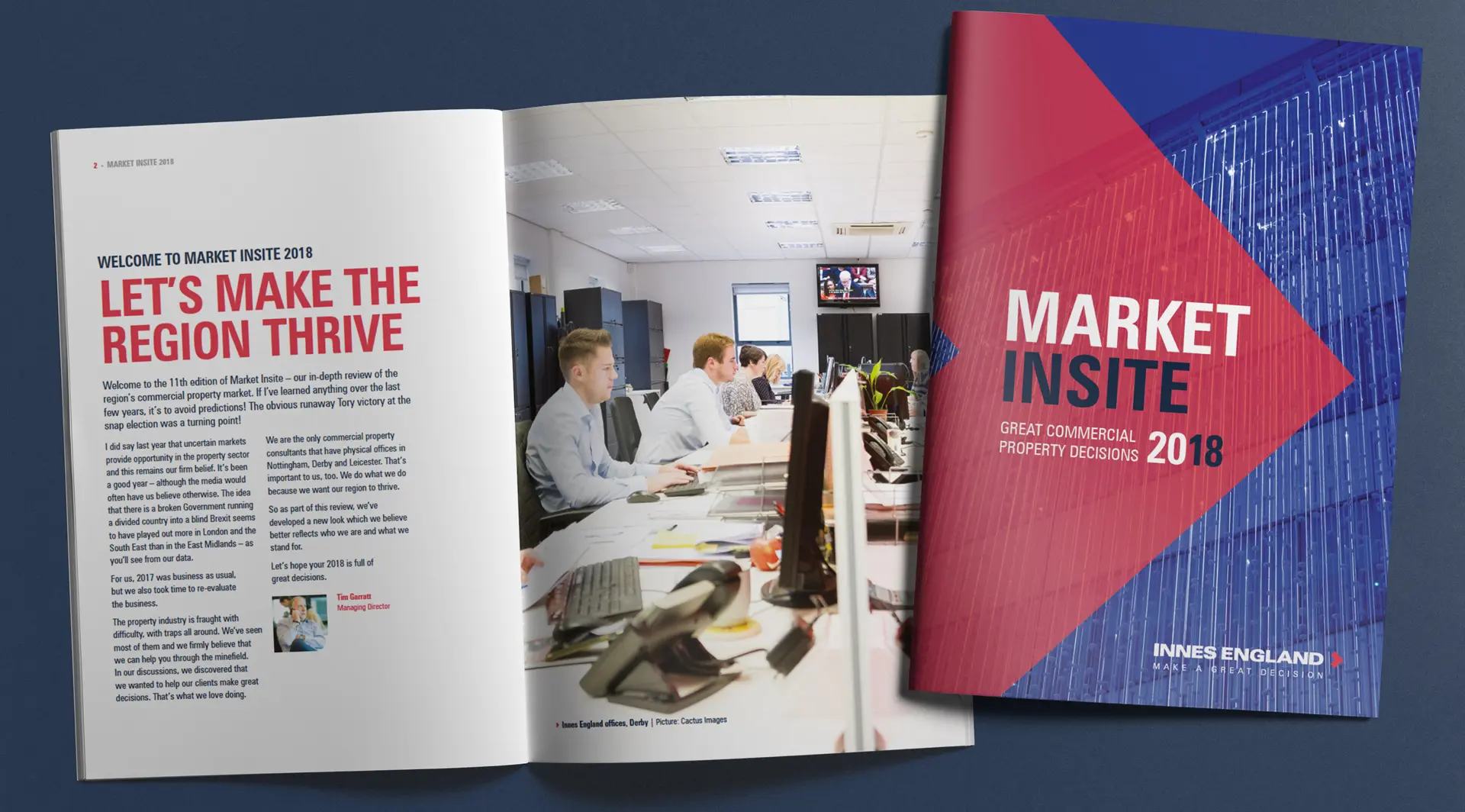
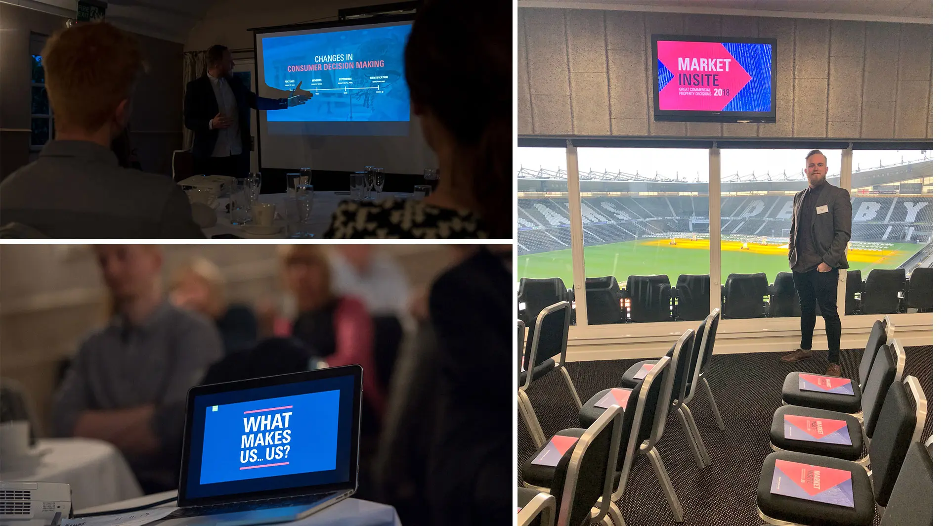
We launched the new brand identity and the thinking behind it to the Innes England team at a special event to ensure staff buy-in. We also helped apply the visual language and applied it to a verity of marketing materials – most famously to the Innes England property ‘For Sale’ boards which are now seen across the East Midlands. A full set of branded templates for the internal teams as well as usage and tone of voice guidelines have been delivered.
The project reached its climax when we were invited to present the principles which we used at Innes England’s annual industry conferences held in Derby, Nottingham and Leicester. At these events, our Creative Director Matt Davies spoke on “The Power of Purpose”. We also produced all of the materials for the events including powerpoint presentations, banner stands and brochures.
The end result then is a fresh, modern visual system by which the brand is now articulating itself. It is more authentic and resinates on a deep emotional level with the brands target audience.
What we didLet’s make your goals a reality. Contact us.